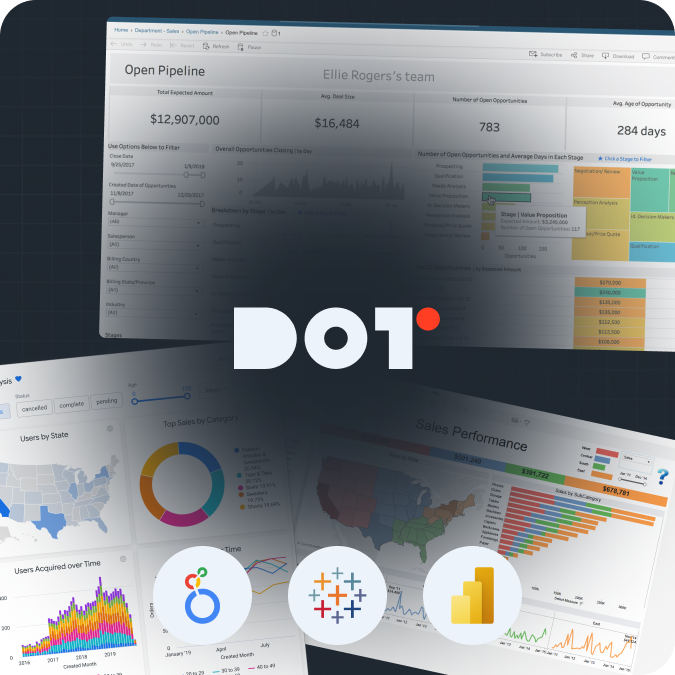

Introduction
As we get closer to 2026, data analytics reporting is changing significantly. New technology, especially in artificial intelligence (AI) and automation, is changing how companies get insights from their data. Creating good data analytics reports is very important for companies that want to make smart choices and quickly react to changes in the market. In the context of data analytics reporting, understanding your audience will significantly enhance the effectiveness of your insights. This article will give you real steps and key insights on how to create effective data analysis reports that will meet future needs, and utilizing data visualization tools will be critical in those efforts.
Key Steps to Create Effective Data Analysis Reports by 2025
Defining Objectives and Audience for Reports
Before you start analyzing data, it’s very important to clearly define the goals of your report. Knowing what you want to achieve begins with figuring out what insights you want to gain. Here are some points to consider:
- Goal of the Report: Are you trying to make a business process better, show how a marketing campaign did, or get ready for a board meeting? Each of these situations will change how you create your report. Gathering insights through data analytics reporting helps clarify these goals.
- Target Audience: Who will read your report? Executives might want high-level summaries, while technical teams may need detailed data. Understanding your audience helps you choose the right data points, making your data analytics reporting more impactful. Remember, the right alignment with key performance indicators (KPIs) can greatly sharpen your focus.
After defining these points, you can adjust the content and style of your report. This means using clear language for your audience and organizing the report with clear headings and subheadings. Clarity in data analytics reporting is essential for decision-making. Additionally, using data storytelling techniques can help convey your message more effectively.
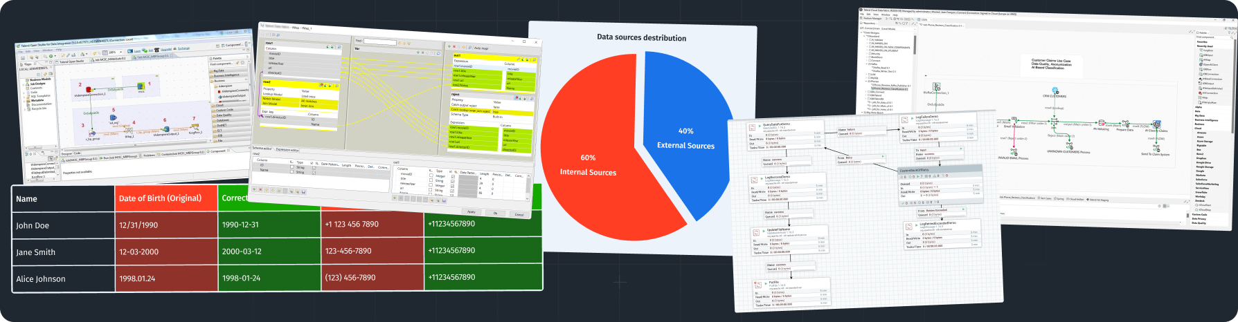
Collecting and Cleaning Data Efficiently
Collecting and cleaning data are crucial steps that affect the quality of your reports. Here’s how to do this well:
- Data Sources: Use reliable data sources suitable for your goals. This can include internal databases, third-party APIs, or online research. Good sources make sure your data is accurate and relevant for your data analytics reporting.
- Data Collection Tools: Choose tools based on the type of data. For web data, Google Analytics works well. For customer data, use tools like Salesforce.
- Data Cleaning Process: After gathering your data, cleaning it is key. Here are some ways to do this:
- Removing Duplicates: Use functions in Excel like “Remove Duplicates,” or use scripts in Python to filter out extra entries.
- Filling in Missing Values: Decide how to handle missing data, like using averages or omitting those rows.
- Standardizing Formats: Keep formats consistent, especially for dates or currencies. For example, use YYYY-MM-DD for dates.
By having a good process for collecting and cleaning data, your reports can be more accurate and trustworthy, ultimately supporting better data analytics reporting. Utilizing automated reporting solutions can also streamline this process further.
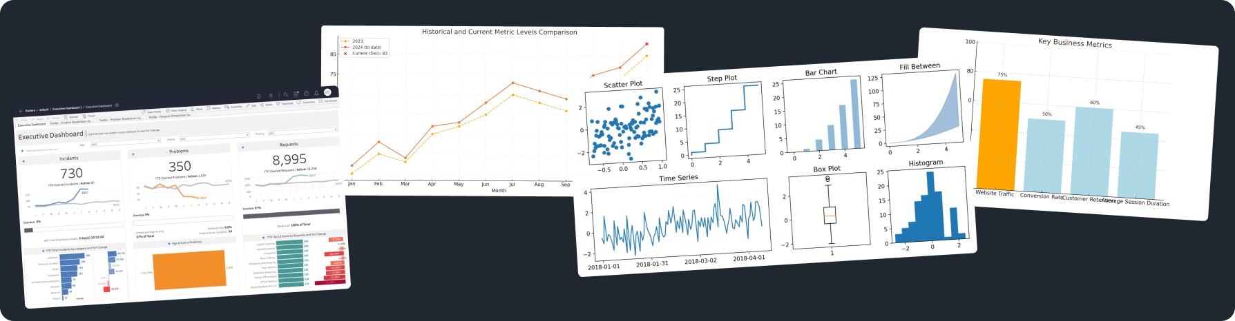
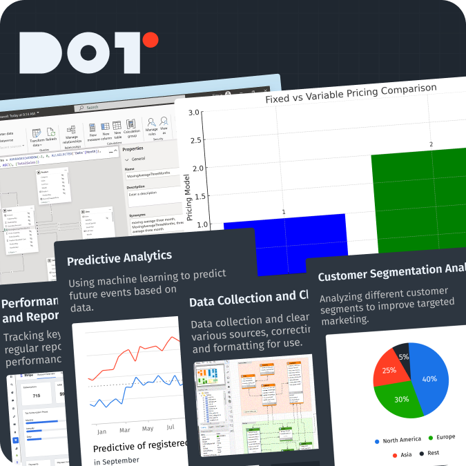
Visualizing Data for Clarity and Impact
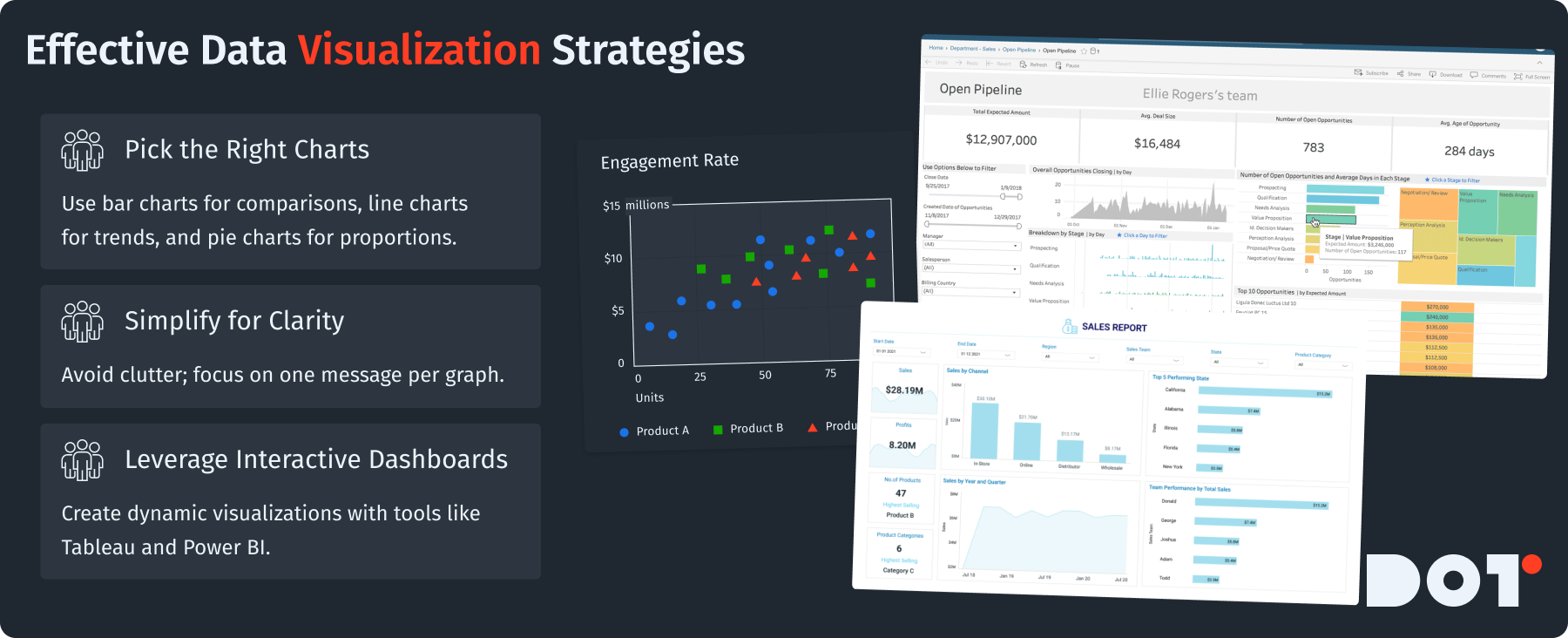
Data visualization helps turn complex data into clear insights. Here are some strategies for good visualizations:
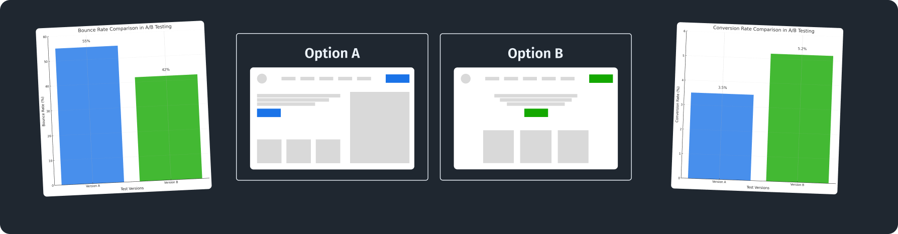
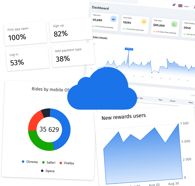
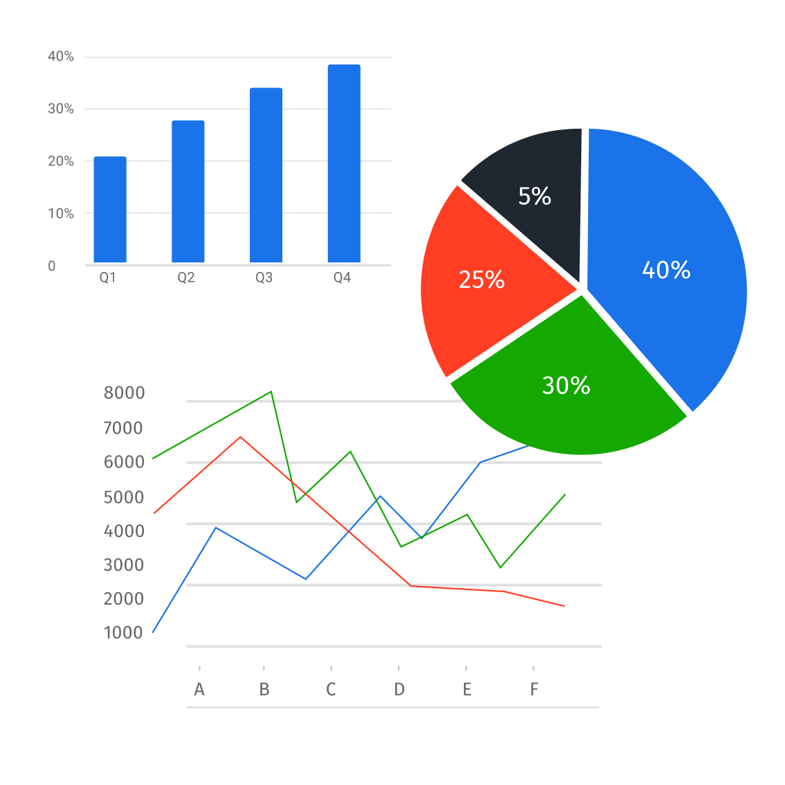
- Choose the Right Charts: Pick the best type of chart. Use bar charts for comparisons, line charts for trends over time, and pie charts for parts of a whole. A line chart can show sales trends clearly.
- Focus on Clarity: Don’t clutter your visualizations. Each should focus on one clear message. Break complex data into separate graphs instead of packing them into one. Effective data analytics reporting depends heavily on clear visual communication, often supported by business intelligence dashboards.
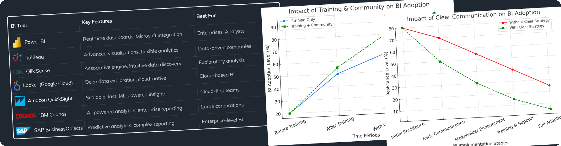
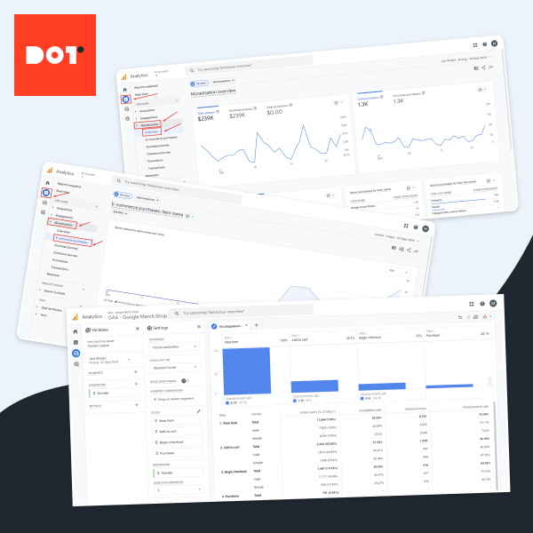
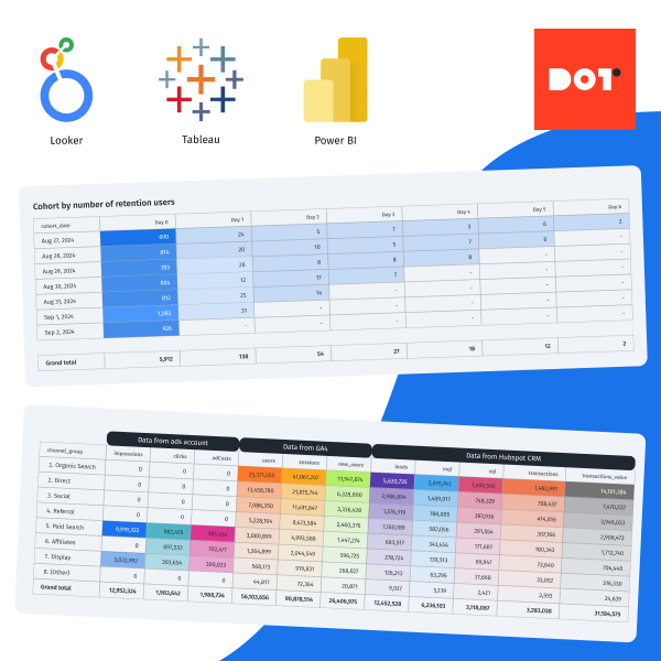
- Interactive Dashboards: Use tools like Tableau and Power BI to create interactive dashboards so stakeholders can explore the data themselves.
Using good visualizations can boost the impact of your reports, making it easier for readers to understand the data in your data analytics reporting.
Have Questions?
These processes can seem hard without real experience. If you have questions, please reach out to a Dot Analytics expert for a free 20-minute consultation. They can give you personalized advice based on what you need, helping you get better at creating data analytics reports.
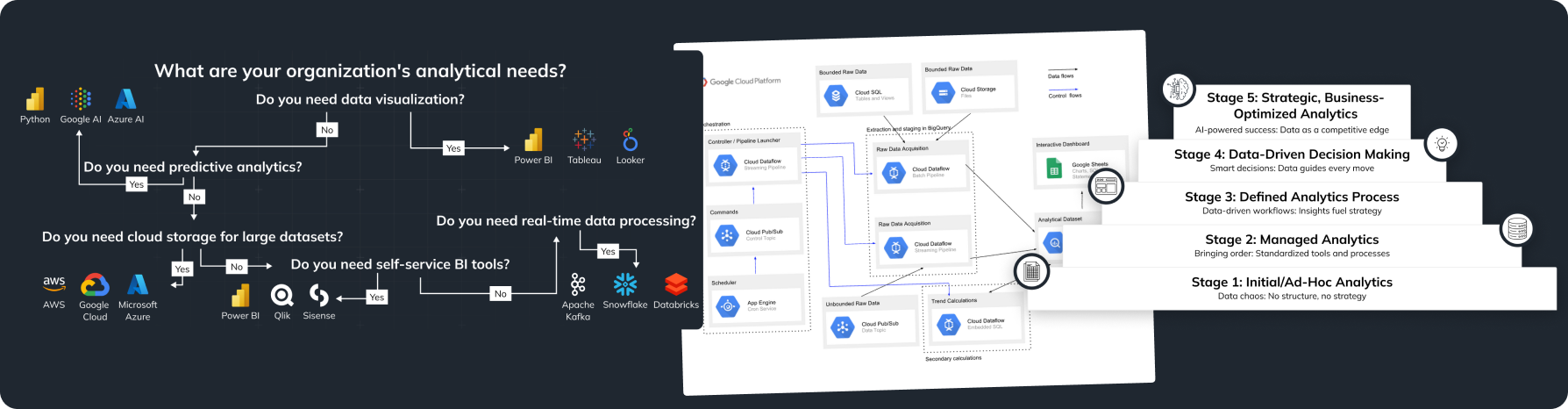
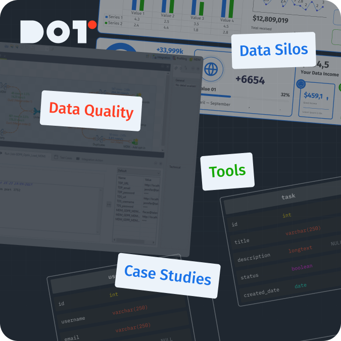
Essential Tools for Data Analytics Reporting in 2025
Introduction to Advanced Analytics Tools
As we look toward 2025, the need for advanced analytics tools will keep growing. These tools help people sift through large amounts of data and find useful insights. Key features to look for include:
- Scalability: Your tool should grow with your data. This is important for companies that expect to grow quickly.
- Integration Capabilities: Good tools should work well with your current data systems, making your workflow smooth.
- Customizability: Choose tools that let you customize them based on your reporting needs.
Benefits of AI and Automation in Reporting Tools
AI and automation are changing how we do data reporting. Here’s how:
- Speed: Automating tasks like data extraction and reporting can save a lot of time. Instead of waiting days for reports, automated tools can give you results right away. Effective data analytics reporting relies on this speed.
- Accuracy: AI reduces the chance of human errors. For example, algorithms can find errors in data.
- Predictive Analytics: Advanced AI tools can predict trends based on past data. This helps businesses to respond to changes before they happen.
Adding AI and automation to your reporting means your organization can do its data analytics faster and more reliably.
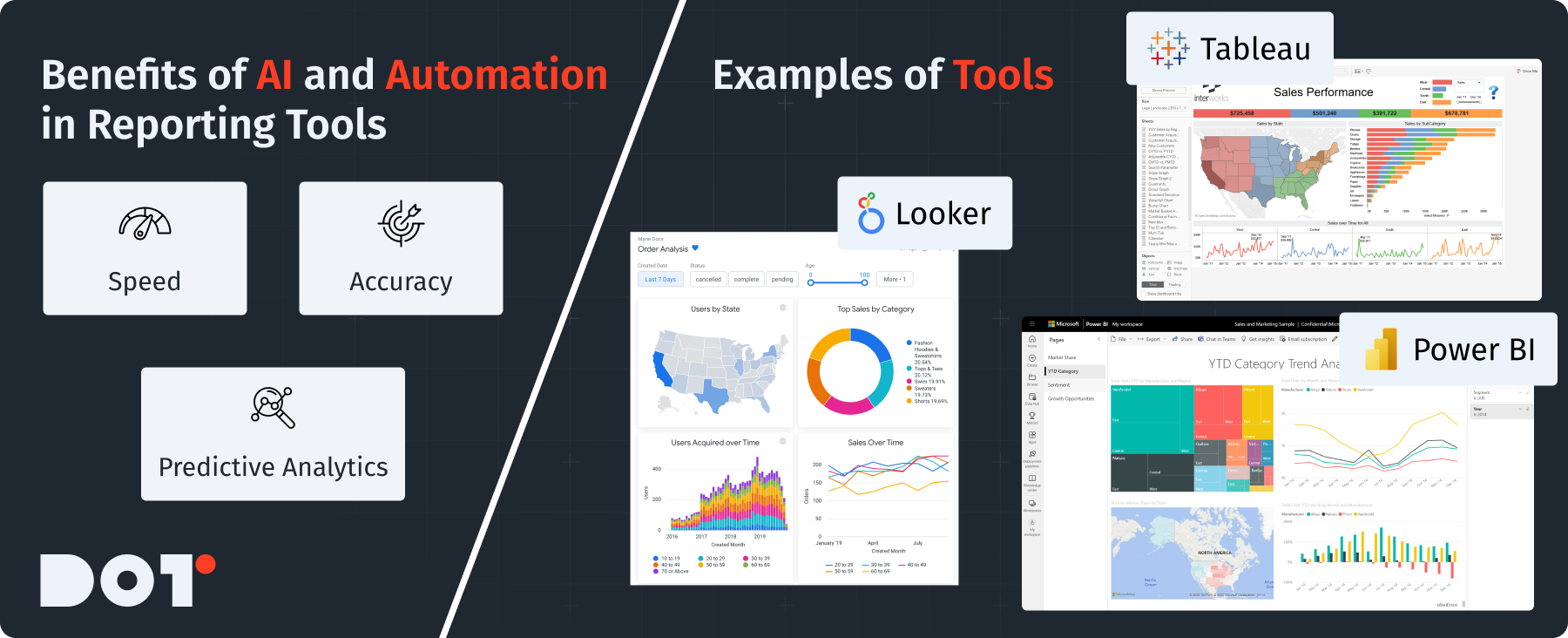
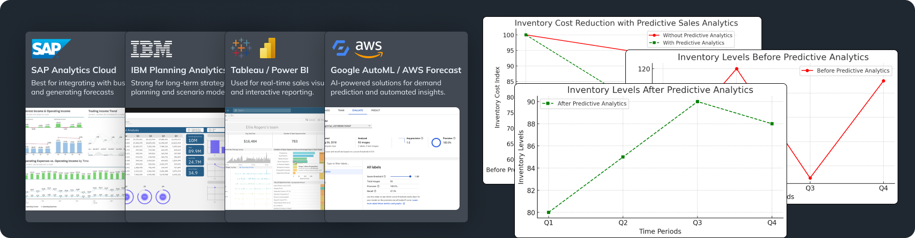
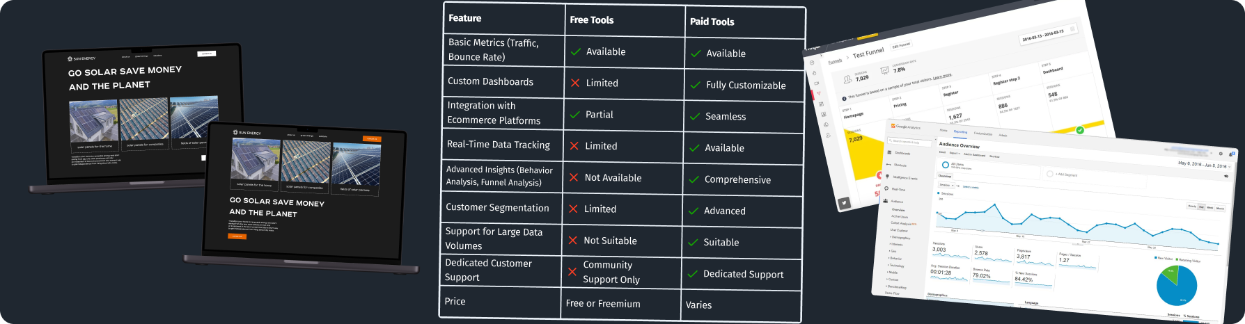
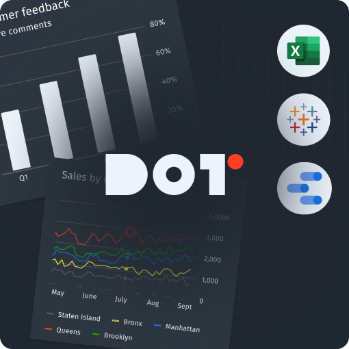
Examples of Tools to Consider: Tableau, Power BI, and Looker
Here are some important tools to think about:
- Tableau: Known for its great visualization abilities, Tableau helps you make detailed dashboards and reports, connecting to different data sources.
- Power BI: This Microsoft tool works easily with other Microsoft products. It’s helpful for visualizing data pulled directly from Excel.
- Looker: Looker is great for creating dynamic reports that can be embedded in apps. It’s perfect for businesses needing advanced reporting. The choice of tool impacts the effectiveness of data analytics reporting.
Choosing the right tool will depend on your business needs and challenges.
Simplifying the Data Reporting Process in Your Organization
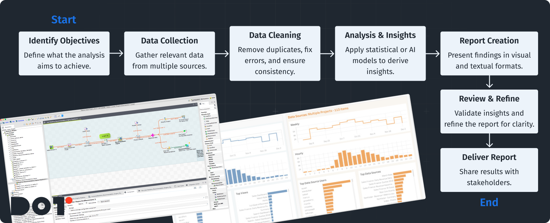
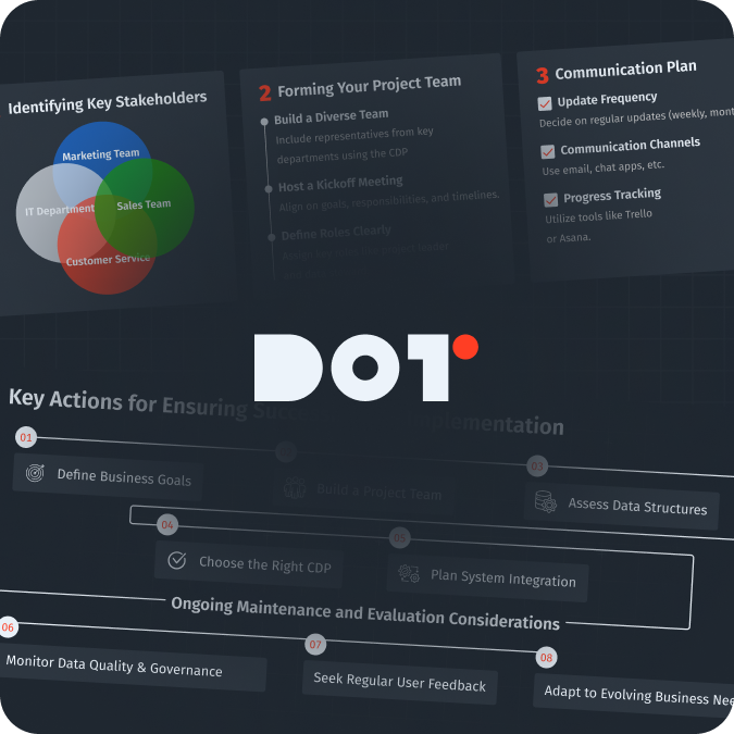
Establishing a Standardized Reporting Workflow
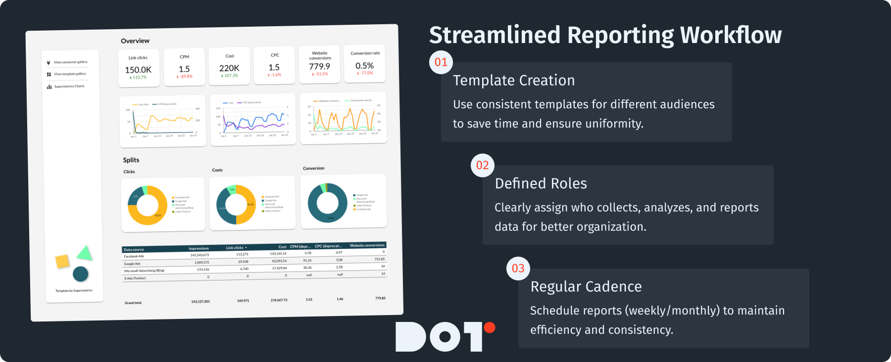
A good reporting workflow helps make your reporting process more efficient and consistent. You can do this by following these steps:
- Template Creation: Create templates for different audiences. Templates save you time and make sure your reports look the same.
- Defined Roles: Assign clear responsibilities in your team. Figure out who collects data, analyzes it, and creates the report. This keeps everything organized.
- Regular Cadence: Set a schedule for when reports will be delivered, like weekly or monthly. This keeps everyone on track.
With a good workflow, you can make your reports more consistent and of higher quality. Consistency is key in data analytics reporting.
Utilizing Collaborative Platforms for Real-Time Insights
Using real-time collaboration tools helps teams communicate better. Tools like Slack, Microsoft Teams, or Asana can help with this. Here’s how:
- Shared Channels: Create channels for specific projects. This keeps everyone informed and discussions ongoing.
- Live Data Updates: Use tools that send live data to collaboration platforms, so everyone has up-to-date information. Real-time reporting can enhance your team’s response to changes swiftly.
- Feedback Loops: Encourage team members to give feedback on reports. This helps improve future reports.
By using collaborative tools, your team can respond faster to changes and keep everyone on the same page, ultimately enhancing your data analytics reporting.
Training and Resources for Team Members
Ongoing training is vital for building a data-driven culture. Here’s how to offer effective training:
- Online Courses: Use platforms like Coursera or Udemy for team members to learn about data analytics tools and skills.
- Workshops and Seminars: Organize workshops led by experts. This gives hands-on experience and deeper understanding.
- Resource Libraries: Create a library of helpful resources like books and articles for your team to access freely. Sharing knowledge about data analytics best practices is vital.
With proper training and resources, your team can become skilled at adapting to data analytics, thus improving data analytics reporting.
Want to See How This Applies to Your Business?
If you need specific strategies designed for your organization, schedule a free 20-minute consultation with one of our experts. They can offer practical insights based on your company’s unique needs.
Metrics to Prioritize in Data Analysis Reports Moving Forward
Identifying Key Performance Indicators (KPIs) Relevant to Business Goals
Organizations should identify which KPIs match their goals. For example:
- Sales Growth Rate: This helps you see how well your product is doing over time.
- Customer Acquisition Cost (CAC): This monitors how much it costs to get a new customer, helping evaluate marketing effectiveness.
- Average Order Value (AOV): AOV helps understand buying behaviors and chances for upselling.
Choosing the right KPIs ensures your reports connect with strategic goals and show performance clearly, which is essential in data analytics reporting.
The Importance of Real-Time Data Metrics
Including real-time metrics in your reports helps organizations make better, quicker decisions. Here’s how:
- Utilizing Streaming Data: Use platforms that handle real-time data from different sources, like web apps or devices. This lets you integrate live data into reports.
- Dashboards for Tracking: Create dashboards that show important metrics in real-time, helping executives see current performance. Leveraging business intelligence dashboards is key for quick visualization of these metrics.
- Alerts and Notifications: Set up alerts for critical changes in metrics. For example, if sales drop suddenly, notifications prompt quick actions.
Real-time data gives a complete view of performance, allowing better decision-making and more effective data analytics reporting.
Integrating Customer Feedback and Engagement Metrics
Focusing on customer feedback and engagement is essential for businesses. Here’s how to do this:
- Sourcing Feedback: Collect feedback through surveys and online reviews.
- Tracking Engagement Metrics: Monitor metrics like Net Promoter Score (NPS) and customer satisfaction to understand customer feelings and actions.
- Analysis: Use insights to drive strategies and improve offerings based on customer feedback.
By including customer-focused metrics, businesses can align better with what clients want, leading to higher satisfaction and better data analytics reporting.
Common Pitfalls to Avoid When Generating Data Analytics Reports
Ignoring the Importance of Context in Data Interpretation
Without context, data can lead to wrong conclusions. Always provide important background in your reports:
- Market Conditions: Mention any relevant market trends. For instance, note if poor sales are due to a broad economic downturn.
- Historical Comparisons: Compare data to relevant past figures. This helps stakeholders see if performance is really dropping or if it’s normal.
- Recommendations: Include actionable recommendations based on the context instead of just stating numbers.
Adding context makes your reports much more meaningful and significantly enhances data analytics reporting.
Overloading Reports with Unnecessary Information
While it’s tempting to include all data collected, too much information can confuse the main points. To avoid this:
- Prioritize Key Findings: Only use data that is important for your objectives. Stay focused on the biggest insights.
- Streamlined Design: Use visuals carefully. Each chart should support your main message; if it distracts, consider leaving it out.
- Executive Summaries: Start reports with a summary of key takeaways for quick understanding.
By keeping focus, your reports will be more effective and actionable, contributing to successful data analytics reporting.
Neglecting the User Experience in Report Design
The design of a report can greatly affect how users interact with it. Here’s how to improve user experience:
- Clear Formatting: Use consistent fonts and headings. This makes reports look professional and easier to read.
- Use of Visual Aids: Use charts and bullet points to simplify complex information and reinforce key points.
- Logical Flow: Organize content so each section leads naturally to the next, enhancing understanding.
Good design helps readers get insights from your data easier and plays a critical role in data analytics reporting.
Ensuring Accuracy and Reliability of Data Analysis Reports
Best Practices for Data Validation and Verification
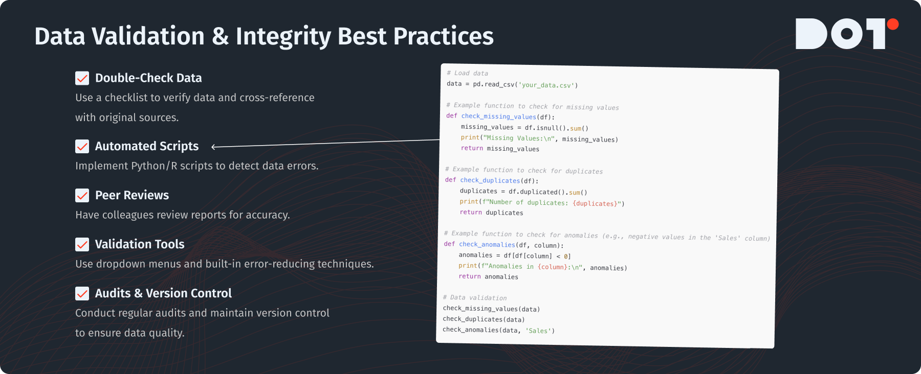
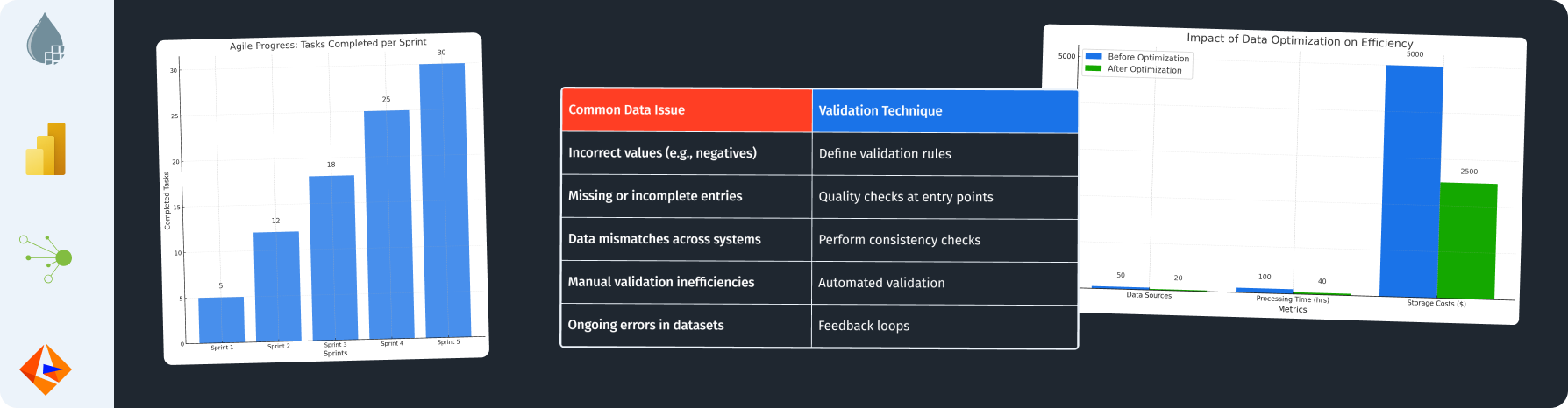
To keep your reports accurate, use best practices for validation and verification:
- Double-Check Data Points: Create a checklist to verify key data before finalizing. Cross-reference with original sources to confirm.
- Automated Validation Scripts: Use languages like Python or R to create scripts that find errors in data.
- Peer Reviews: Have colleagues check reports for accuracy before sharing. Another set of eyes can catch errors you might miss.
These practices help ensure your data analytics are trustworthy and support effective data analytics reporting.
Methods to Ensure Data Integrity During Collection and Analysis
Keeping data integrity during collection and analysis is critical. You can ensure this through:
- Validation Techniques: Use built-in techniques in your data tools to reduce entry errors, like dropdown menus for choices.
- Regular Audits: Plan regular checks of your data methods and datasets to ensure quality.
- Version Control: Keep records of all changes made to your data, which maintains transparency.
Strong methods keep your data processes reliable, reinforcing the quality of your data analytics reporting.
The Role of Peer Reviews and Audits in Reporting
Peer reviews and audits are important for quality in data reports:
- Structured Review Process: Have a group responsible for reviewing reports before sharing. They should check for accuracy and clarity.
- Internal Audits: Regularly check compliance with standards in reports. This helps find weaknesses.
- Feedback Implementation: Use feedback from reviews to improve reporting processes.
Adding peer reviews improves the quality and trustworthiness of your reports, essential for reliable data analytics reporting.
Skills Necessary for Professionals in Data Analytics by 2025
Importance of Technical Skills in Analytics Tools and Software
In today’s data world, you need technical skills in analytics tools. Here are some key skills to develop:
- Proficiency in Analytical Software: Learn tools like Tableau and Power BI for effective data visualization.
- Data Manipulation Skills: Know programming languages like SQL, Python, or R to analyze data and create reports.
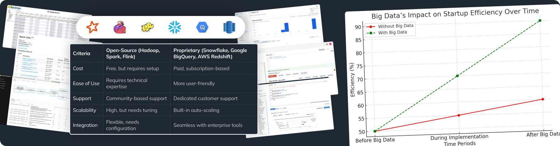
- Understanding Big Data: Be familiar with frameworks like Hadoop or Spark. This helps in managing large datasets.
By building these skills, you position yourself well in the evolving field of data analytics reporting.
Critical Thinking and Analytical Problem-Solving Skills
Critical thinking is essential in data analytics. Here’s how to strengthen these skills:
- Encourage Curiosity: Cultivate curiosity in your team to ask questions about data.
- Scenario-Based Learning: Use exercises where professionals analyze data and make solutions based on insights.
- Practice: Regularly work on analytical challenges to improve problem-solving skills.
Developing critical thinking helps you draw valuable conclusions from data that are crucial to effective data analytics reporting.
Interpersonal Skills for Collaboration and Communication in Teams
Collaboration and communication are as important as technical skills. Here’s how to enhance these skills:
- Engage in workshops for clear communication. This can help in making better presentations.
- Work in cross-functional teams to share ideas and improve communication across different expertise.
- Create systems for giving constructive feedback, ensuring everyone feels included in discussions.
Strong interpersonal skills help deliver insights effectively, facilitating superior data analytics reporting.
Do You Fully Understand the Topic?
If you feel confused about any ideas, please connect with a Dot Analytics expert for a free 15-minute consultation. They can help explain complicated topics and support you in your learning journey.
Case Study: fuboTV’s Data Reporting Transformation
Company Introduction
fuboTV is a live TV streaming service focused on sports, with channels for entertainment and news. It offers unique features like cloud DVR and access on many devices, letting viewers customize their experience.
Challenge
The fuboTV team had big issues with manual reporting, which made analyzing audience engagement hard. This slow process risked inaccurate data and missed insights about viewer habits. Transitioning to automated data analytics reporting was crucial for them.
Solution Description
To improve reporting, fuboTV set up an automated reporting system with advanced analytics tools to create timely insights.
What They Did
- Established a New Data Environment: They built a strong data structure focused on audience behavior analysis.
- Leveraged Data Visualization Tools: fuboTV used Tableau for rich, interactive visualizations to enhance reporting clarity. This greatly improved data analytics reporting.
Team Composition
- Data Analysts: 3 experts who analyze the data.
- Data Engineers: 2 skilled people who build and maintain the data structure.
- BI Specialists: 2 dedicated to business intelligence and visual efforts.
Project Duration
The project took about 6 months from planning to execution.
Technologies Used
- Tableau: For visualizing big datasets and real-time reporting.
- Google Analytics: To track viewer engagement metrics.
Results
The new reporting system cut down report generation time by 50%. Insights helped increase viewer engagement by 30%, showing how valuable effective data analytics reporting can be.
Case Study: Atisfy’s AI-Driven Analytics Reporting
Company Introduction
Atisfy connects brands with influencers for marketing campaigns, using data to boost campaign performance with actionable insights through data analytics reporting.
Challenge
Atisfy struggled with slow manual analysis of campaign data, which affected report times and missed optimization chances.
Solution Description
They moved to automated, AI-driven tools for better data analysis and reporting.
What They Did
- Streamlined Campaign Metric Analysis Processes: They improved how they captured and processed data.
- Implemented AI Algorithms: These helped predict trends and make decoding data faster.
How They Did It
- Introduced Machine Learning Models: They used algorithms to find patterns in historical data.
- Used Looker for Integrated Reporting: Atisfy employed Looker for real-time reports integrated into client apps, enhancing their data analytics reporting capabilities.
Team Composition
- 2 Data Scientists focused on predictive models.
- 2 ML Engineers: who integrated AI tools.
- 2 Marketing Analysts translating campaign data into strategies.
Project Duration
The project took 8 months, highlighting Atisfy’s quick adaptability.
Technologies Used
- Looker: For real-time reporting and visualization.
- Python: For developing machine learning models.
Results
Atisfy’s new AI-driven reporting cut reporting times by 65%. The upgrade improved campaign performance by 25% in the first quarter, showcasing the effectiveness of streamlined data analytics reporting.
Checklist for Effective Data Analytics Reporting
- Define objectives and audience: Identify who needs the report and what they seek.
- Collect and clean data: Ensure data is relevant and error-free.
- Visualize data: Use effective charts and graphs to support your main findings without clutter.
- Establish a workflow: Have clear roles and processes to streamline reporting.
- Review: Have peers check your findings before sharing.
Summary
In conclusion, to create effective data analysis reports by 2025, you need a clear approach: define your goals, use advanced tools, and prioritize important metrics. It’s also essential to equip professionals with the skills they need and ensure good communication within teams. The data analytics reporting landscape is changing, and it’s vital for decision-making. If this topic interests you, please schedule a free 20-minute consultation with a Dot Analytics expert to see how your organization can harness these insights.


Leave a Reply