Data Science Automation: Streamlining Workflows for Peak Efficiency
Overview of Data Science Automation
In today’s technological landscape, data science automation transforms how organizations handle vast amounts of data. Businesses can optimize workflows and focus on strategic decision-making by automating repetitive and complex tasks. This shift accelerates data analysis and enhances the accuracy and scalability of data-driven decisions.
As companies grapple with increasing volumes of information, automating data workflows has become essential. Data science automation helps manage resources effectively, integrating analytics platforms and advanced capabilities to ensure timely and actionable insights. This approach streamlines operations and positions organizations to respond swiftly to market changes.
What is Automation in Data Science?
Definition and Scope
Automation in data science refers to the use of tools and technologies to streamline the data science pipeline—from data collection and cleaning to model building and deployment. It involves automating tasks that traditionally require manual intervention, reducing the potential for human error and speeding up processes.
Core Components
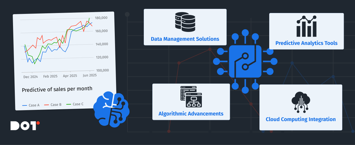
The core components of data science automation include:
- Data Management Solutions: Automating data collection, storage, and retrieval to handle big data efficiently.
- Predictive Analytics Tools: Utilizing algorithms that can learn and make predictions with minimal human input.
- Algorithmic Advancements: Implementing cutting-edge algorithms that require less manual tuning and can adapt to new data.
- Cloud Computing Integration: Leveraging cloud resources for scalable computing power and storage, facilitating access to advanced analytics capabilities without significant infrastructure investment.
Data Science Automation Tools and Techniques
Overview of Tools
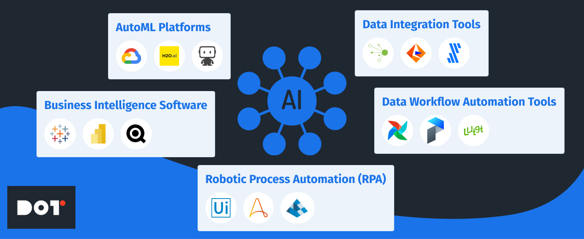
A variety of data science automation tools are available in the market, each offering unique features:
- AutoML Platforms: Tools like Google Cloud AutoML, H2O.ai, and DataRobot automate machine learning model selection and hyperparameter tuning, making it easier to develop accurate models quickly.
- Business Intelligence Software: Platforms such as Tableau, Microsoft Power BI, and QlikView automate data visualization and reporting, allowing for real-time insights and decision support systems.
- Data Workflow Automation Tools: Solutions like Apache Airflow, Prefect, and Luigi manage and schedule automated data pipelines, ensuring data is processed and available when needed.
- Data Integration Tools: Services like Talend, Informatica, and Fivetran automate the integration of data from various sources, enhancing data quality and consistency.
- Robotic Process Automation (RPA): Tools like UiPath, Automation Anywhere, and Blue Prism automate repetitive tasks, freeing up human resources for more complex activities.
Techniques for Data Automation
Automation techniques in data science include:
- Automating Data Collection: Using web scraping tools like Scrapy and Beautiful Soup, and APIs to gather data efficiently from multiple sources.
- Data Cleansing Automation: Implementing scripts and tools such as Pandas and Dask that handle missing values, duplicates, and outliers to improve data quality.
- Model Building Automation: Employing AutoML platforms for selecting the best algorithms and tuning models without extensive manual intervention.
- Deployment Automation: Using continuous integration and continuous deployment (CI/CD) pipelines with tools like Jenkins, GitLab CI/CD, and Docker for deploying models into production environments seamlessly.
External Instruments to Consider
For organizations looking to implement data science automation, the following instruments can be highly beneficial:
- Alteryx: An end-to-end analytics platform that automates data preparation, blending, and advanced analytics.
- KNIME Analytics Platform: An open-source platform for creating data science workflows, integrating various tools and algorithms.
- AWS SageMaker: A fully managed service that provides the ability to build, train, and deploy machine learning models at scale.
- Azure Machine Learning: Microsoft’s cloud-based environment for training, deploying, and managing machine learning models.
- IBM Watson Studio: A platform that provides tools for data preparation, model development, and deployment in a collaborative environment.
Benefits of Automating Data Science Workflows
Data Efficiency Gains
Automation significantly speeds up data processing and analysis. Tasks that once took weeks can now be completed in hours, enabling teams to focus on strategic initiatives rather than routine tasks. This acceleration enhances productivity and allows organizations to respond swiftly to new opportunities or challenges.
Accuracy and Reliability
By minimizing human error, automation increases the reliability of data insights. Automated systems ensure consistent application of algorithms and methodologies, leading to more accurate results. This consistency is crucial for maintaining the integrity of analyses and making sound business decisions.
Scalability
Automation supports scaling operations without a proportional increase in resources. With cloud computing integration, organizations can handle larger datasets and more complex analyses effortlessly. This scalability is essential for growing businesses that need to adapt quickly to increasing data volumes.
Cost Savings
By streamlining processes and reducing manual labor, automation can lead to significant cost reductions. Organizations can reallocate resources to higher-value activities, such as strategic planning and innovation, enhancing overall competitiveness.
Challenges and Considerations in Data Science Automation
Complexity and Cost
Implementing automation can be complex and may require significant upfront investment in tools and training. Organizations need to carefully assess the return on investment and plan accordingly. It’s essential to choose solutions that align with business goals and have a clear implementation roadmap.
Ethical and Security Issues
Automation introduces risks related to data privacy and security. Handling sensitive data requires robust security measures and compliance with regulations like GDPR or HIPAA. Ethical considerations, such as algorithmic bias, must be addressed to ensure fair and unbiased outcomes. Transparency in how automated systems make decisions is also critical to maintain trust.
Change Management
Transitioning to automated systems requires change management to address resistance from staff accustomed to manual processes. Training and clear communication are essential to facilitate adoption. Organizations should foster a culture that embraces technological advancements and continuous learning.
Future Trends in Data Science Automation
Emerging Technologies
- Artificial Intelligence Implementation: Integration of AI in automation tools will enhance capabilities, enabling more sophisticated analyses and decision-making processes.
- AutoML Advancements: Further developments in AutoML will simplify model building and deployment even more, making advanced analytics accessible to non-experts.
- Natural Language Processing (NLP): Automation tools will increasingly incorporate NLP to handle unstructured text data, opening new avenues for insights.
- Edge Computing: Processing data closer to its source will reduce latency and improve real-time analytics, especially important for Internet of Things (IoT) applications.
Industry Predictions
- Increased Adoption Across Industries: Sectors like manufacturing, healthcare, and finance will continue to adopt automation to stay competitive and meet growing data demands.
- Enhanced Operational Analytics: Organizations will leverage automation for real-time analytics, improving operational decision-making and responsiveness.
- Greater Emphasis on Explainability: As automation becomes more prevalent, there will be a focus on making automated processes transparent and explainable to stakeholders.
How to Implement Data Science Automation in Your Organization
Step-by-Step Guide
- Assess Current Workflows: Identify processes that are time-consuming and prone to errors. Evaluate where automation can have the most significant impact.
- Define Objectives: Set clear goals for what automation should achieve, such as reducing processing time, improving accuracy, or scaling operations.
- Choose the Right Tools: Research and select tools that fit your organization’s needs and infrastructure. Consider factors like scalability, ease of use, and support.
- For data integration, consider Fivetran or Stitch Data.
- For machine learning, evaluate DataRobot or H2O.ai.
- For data visualization, tools like Looker or Power BI might be suitable.
- Develop a Pilot Project: Start with a small, manageable project to demonstrate the benefits of automation. Use this as a learning experience to refine your approach.
- Train Your Team: Invest in training to ensure staff are comfortable with new tools and processes. Encourage continuous learning and skill development.
- Integrate with Existing Systems: Ensure new automation tools can seamlessly integrate with current systems to avoid disruptions.
- Monitor and Evaluate: Continuously monitor performance and make adjustments as necessary. Gather feedback from users and stakeholders.
- Scale Up: Gradually extend automation to other areas of the organization, building on successes and lessons learned.
Key Factors to Consider
- Infrastructure: Evaluate whether your current IT infrastructure can support new automation tools, or if upgrades are needed. Consider cloud solutions for flexibility.
- Skills and Expertise: Assess the skill levels of your team and consider hiring or training to fill gaps. Collaboration between data scientists and IT professionals is crucial.
- Data Quality: Ensure that the data used is clean and reliable to maximize the effectiveness of automation. Implement data governance practices.
- Organizational Culture: Foster a culture that embraces innovation and continuous improvement. Leadership support is vital for successful adoption.
Case Studies from Dot Analytics
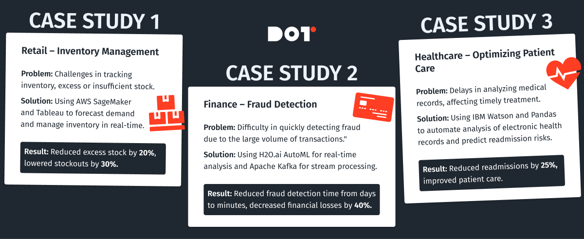
Case Study 1: Retailer Enhances Inventory Management with Automation
Challenge: A large retail company struggled with inventory management due to data silos and manual processes, leading to stockouts and overstock situations.
Solution: By implementing data science automation tools like Alteryx for data integration and Tableau for real-time visualization, they automated data collection from sales, suppliers, and warehouses. They used AWS SageMaker to build predictive models for demand forecasting. Machine learning models like XGBoost were employed for their accuracy in regression tasks.
Outcome: This enabled real-time inventory tracking and accurate demand forecasting. As a result, they reduced stockouts by 30% and decreased excess inventory by 20%, leading to significant cost savings and improved customer satisfaction.
Case Study 2: Financial Institution Improves Fraud Detection
Challenge: A financial institution faces challenges in detecting fraudulent transactions promptly due to the sheer volume of transactions and sophisticated fraud techniques.
Solution: They adopted automated data science techniques by implementing H2O.ai’s AutoML to analyze transaction data in real time. They also used Apache Kafka for real-time data streaming and Apache Spark for big data processing. Machine learning models such as Random Forest and Deep Learning Neural Networks were utilized for their effectiveness in classification tasks.
Outcome: By integrating advanced analytics capabilities and achieving machine learning efficiency, they developed models that automatically flagged suspicious activities. This automation reduced fraud detection time from days to minutes and decreased financial losses by 40%, enhancing trust with their customers.
Case Study 3: Healthcare Provider Streamlines Patient Care
Challenge: A healthcare provider aimed to improve patient care by analyzing electronic health records (EHR). Manual data processing was time-consuming and error-prone, affecting the ability to make timely decisions.
Solution: By automating data extraction and analysis using IBM Watson Health and Python libraries like Pandas and Scikit-learn, they could predict patient readmission risks and personalize treatment plans. They utilized Natural Language Processing (NLP) techniques, specifically SpaCy and NLTK, to extract information from unstructured clinical notes. Machine learning models like Logistic Regression and Support Vector Machines (SVM) were employed for predictive analytics.
Outcome: This led to a 25% reduction in readmission rates and improved patient outcomes, demonstrating the power of data-driven healthcare solutions.
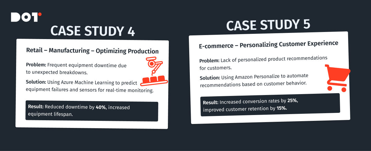
Case Study 4: Manufacturing Company Optimizes Production with AI
Challenge: A manufacturing company faced inefficiencies in production due to equipment downtime and maintenance issues.
Solution: They implemented Azure Machine Learning to develop predictive maintenance models. Sensors on equipment provided real-time data, which was analyzed using machine learning algorithms like Time Series Analysis and Anomaly Detection models. Tools like TensorFlow and Keras were used for building deep learning models to predict equipment failures before they occurred.
Outcome: The company reduced unplanned downtime by 40%, increased equipment lifespan, and improved overall production efficiency, resulting in significant cost savings.
Case Study 5: E-commerce Platform Enhances Customer Experience
Challenge: An e-commerce company wanted to improve customer experience by providing personalized product recommendations but struggled with manual data processing and analysis.
Solution: They adopted automated data science tools like Apache Mahout and Amazon Personalize to build recommendation systems. Machine learning models such as Collaborative Filtering and Content-Based Filtering were utilized to analyze customer behavior and preferences.
Outcome: Personalization efforts led to a 25% increase in sales conversions and a 15% boost in customer retention rates, highlighting the impact of automated data science on customer engagement.
Conclusion and Call to Action
Data science automation is transforming how organizations handle data, offering increased efficiency, accuracy, and scalability. While challenges exist, the benefits of automating data workflows far outweigh the risks. By embracing automation, businesses can stay ahead in a competitive landscape, making data-driven decisions more quickly and effectively.
Do you fully understand the topic? If not, you can book a free 15-minute consultation with an expert from Dot Analytics.
Ready to take the next step in automating your data science workflows? Contact us today to explore customized solutions for your organization.

E-commerce Analytics Examples: Real-World Cases to Inspire Your Strategy
In this article, we will describe the process of analyzing e-commerce data in the Google Analytics 4 environment, including E-commerce Analytics Examples.
E-commerce Analytics: What It Is and Why It’s Needed
E-commerce Analytics is a tool that allows for a detailed study of user behavior on websites that sell products or services. With e-commerce tracking, you can monitor every stage of the user journey—from the first website visit to making a purchase—and analyze various sales-related metrics.
Setting up e-commerce is the process of configuring analytics tools to track and analyze data on sales and user interactions with your site. This setup enables you to gain deeper insights into customer behavior, the effectiveness of marketing campaigns, and the overall performance of your online business.
There are several options for setting up e-commerce:
- By creating technical specifications for developers using Google’s documentation
- Manual setup through Google Tag Manager (the fastest but least accurate option)
- Through built-in functionalities of platforms/marketplaces (like WooCommerce, Magento, OpenCart, Shopify)
Problems Solved by E-commerce Tracking
- Tracking Key Metrics: You can monitor indicators such as the number of transactions, average order value, conversion rates, revenue, product popularity, and more.
- Sales Funnel Analysis: Understanding how users navigate your site—from the first visit to making a purchase—helps optimize the sales process.
- Evaluating Marketing Campaign Effectiveness: Determine which marketing channels lead to the highest number of sales and greatest profits.
- Audience Segmentation: The ability to create user segments based on their purchasing behavior allows for more personalized advertising campaigns.
- Site Optimization: Analyzing data on user interactions helps identify site issues and improve the user experience.
Types of Metrics in E-commerce Analytics
When setting up e-commerce tracking, you can monitor two types of analytical metrics:
Quantitative Analytics
- Sales Metrics: Sales volume, average order value, purchase frequency, Customer Acquisition Cost (CAC).
- User Behavior: Number of visitors, number of sessions, time spent on the site, viewing depth, bounce rate.
- Marketing Analytics: Effectiveness of advertising campaigns (CTR, conversion rate), cost of customer acquisition(CAC) from different channels, conversion rates(CR) for key actions (purchases).
Qualitative Analytics
- Customer Reviews: Analysis of product and service reviews to identify strengths and weaknesses.
- Research: Surveys and focus groups to understand customer needs and preferences.
- Sales Funnel Analysis: Identifying stages where customers most often abandon their purchase.
Examples of Some E-Commerce Analytics Metrics and Their Applications
- Conversion Rate: Shows the percentage of visitors who perform a target action (e.g., make a purchase). A low conversion rate may indicate problems with website design, navigation, or the product/service itself.
- Average Order Value: Allows you to assess the average amount customers spend on a single order. Analyzing this metric helps determine which products or services are most popular and how to increase the average purchase amount.
- Customer Lifetime Value (LTV): Estimates the total revenue a company earns from a single customer over the entire period of interaction. A high LTV indicates customer loyalty and the effectiveness of loyalty programs.
- Segmentation Analysis: Dividing customers into groups based on various criteria (age, gender, interests) allows for creating personalized offers and increasing the effectiveness of marketing campaigns.
- Sales Funnel Analysis: Helps identify bottlenecks in the purchasing process and optimize each stage.
Overview of Basic E-commerce Analytics Examples Using Google Analytics 4
Main Steps:
Setting Up E-commerce Tracking:
- Tracking Code: Ensure that the correct GA4 tracking code is installed on all pages of your website.
- Events: Configure events to track actions such as:
- view_item: Viewing a product
- add_to_cart: Adding a product to the cart
- begin_checkout: Initiating the checkout process
- purchase: Completing a purchase
– In the enhanced version of e-commerce, there are many more standard events. In this example, we use these four as the main stages of the funnel.
Event Parameters:
For accurate funnel construction, each event should include the following parameters:
- item_id: Unique product identifier
- item_name: Product name
- item_category: Product category
- price: Product price
- currency: Currency
- quantity: Number of products
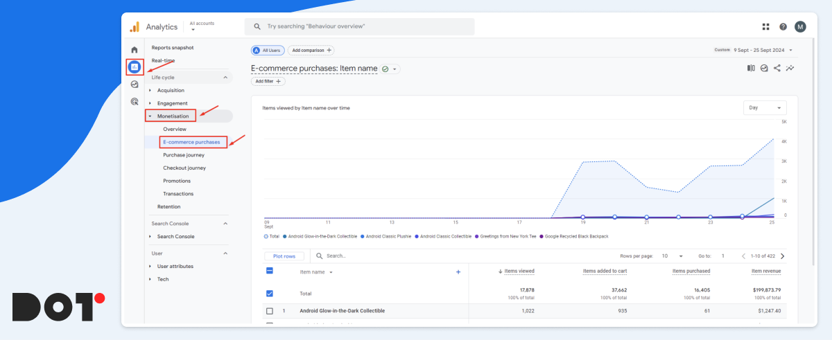
Standard Reports: GA4 offers a range of standard reports under the Monetization tab:
- Overview: Provides general information about sales and the number of users
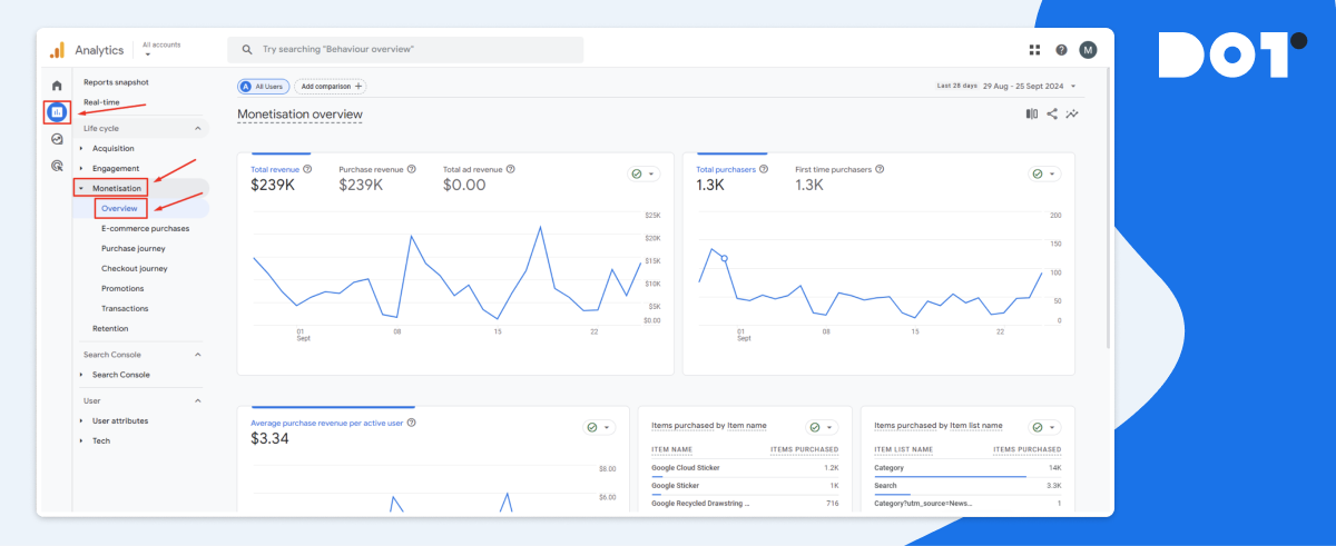
- Purchases: Provides detailed information about the number of funnel events and the revenue generated from each individual product.
- Path to Purchase: Displays how users navigate through the sales funnel on your e-commerce website or app.
By relying on the information presented in the basic reports, you can delve deeper into:
Revenue: Total revenue, revenue by product, revenue by traffic source.
Conversions: Number of purchases, conversion rate through the sales funnel.
User Behavior: Time on site, pages per session, average purchase value.
All the reports mentioned above can be further adjusted and customized to suit your needs. You can also create your own for more in-depth analysis using various dimensions and metrics.
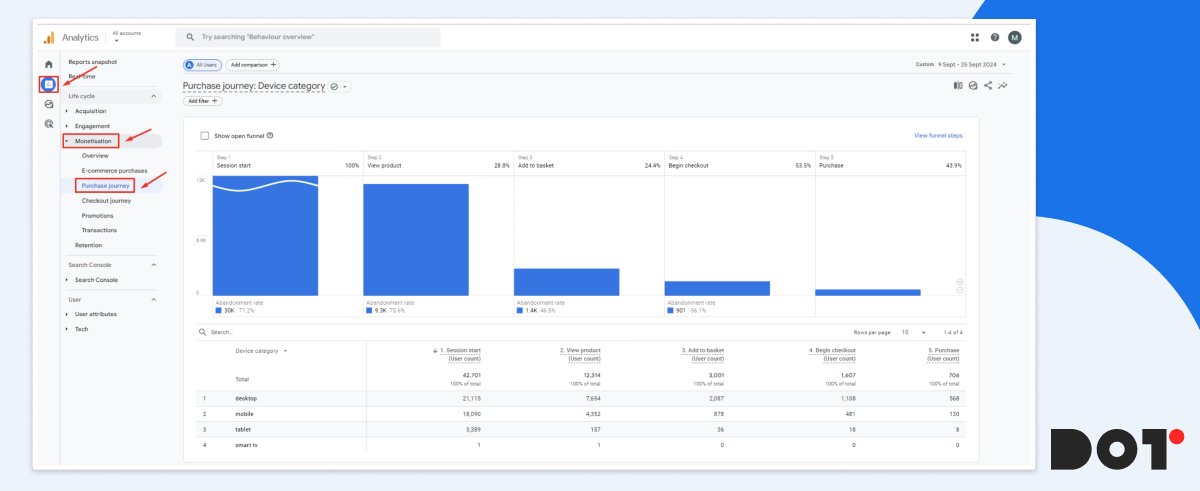
Setting Up Display and Analysis of the Sales Funnel in E-commerce
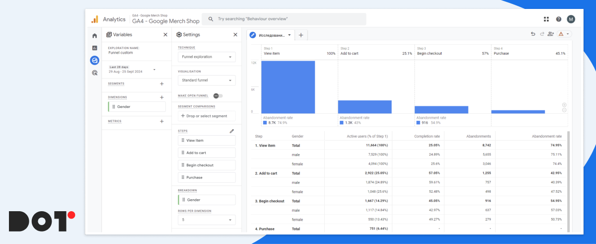
The sales funnel visualizes the user’s journey from the first contact with your website or application to making a purchase. In GA4, this allows you to understand at which stages clients “drop off” and where potential problems may lie.
This information is contained in the standard report located under Monetization > Path to Purchase, but this time we will examine the necessary steps to create such a report in the Explorations section.
Steps to Create a Funnel in GA4:
- Defining Funnel Steps: For example, viewing a product page, adding to the cart, proceeding to checkout, and completing the purchase.
- Selecting Additional Parameters for Analysis: For instance, we need to understand which gender of users buy our products more frequently over a specified period.
From the research, we see that during the period from August 25 to September 21, men purchased our products 70% more often than women. Therefore, it would be logical to launch a test advertising campaign targeting men and then compare its conversion rate with the overall rate to confirm the hypothesis.
Using the funnel, you can extract a lot of useful information, for example:
- Conversion at Each Stage: Assess what percentage of users moves from one stage to the next. A low conversion rate may indicate problems with design, content, or other factors.
- Time at Each Stage: Measure the average time users spend at each stage. A long duration may indicate difficulties in progressing through the funnel.
- User Drop-off: Identify stages where the highest user drop-off occurs. This helps pinpoint “bottlenecks” in the funnel.
- Data Segmentation: Use segmentation to compare the behavior of different user groups (e.g., new vs. returning users, mobile vs. desktop, men vs. women).
- Comparison with Historical Data: Track changes in conversion over time and compare them with periods before changes were made to the site or marketing campaigns.
E-commerce Analytics Examples from Dot Analytics
Case 1: Combating Abandoned Carts
Problem:
An online retailer noticed a high abandonment rate between the “Add to Cart” and “Begin Checkout” stages, it’s a typical e-commerce problem. Specifically, 68% of users who added items to their cart did not proceed to checkout, leading to significant lost revenue opportunities.
Solution:
Using Google Analytics 4, the team conducted a thorough analysis to identify where users were dropping off. They discovered that the checkout process was cumbersome, with lengthy forms and confusing instructions.
- Simplified the Checkout Form: Reduced the number of fields from 15 to 7 by eliminating unnecessary information requests.
- Enhanced User Guidance: Added clear, user-friendly error messages and tooltips to assist users in filling out the form correctly.
- Implemented Cart Saving Feature: Allowed unregistered users to save their carts, encouraging them to return and complete their purchases later.
Result:
After implementing these changes over a two-month period:
- Abandoned Cart Rate Decreased by 30%: Dropped from 68% to 47%, recovering potential monthly revenue of approximately $75,000.
- Average Order Value Increased by 12%: Increased from $80 to $90 as users found the checkout process more straightforward and added more items.
- Customer Satisfaction Improved: Positive feedback increased by 20%, indicating a better user experience.
Case 2: Personalizing Product Recommendations
Problem:
The company faced a low average order value (AOV) of $65. Customers typically purchase single items without adding complementary products, limiting revenue potential per transaction.
Solution:
Analyzed customer purchase history and on-site behavior using GA4’s enhanced tracking features.
- Developed a Personalized Recommendation Engine: Used ML algorithms to suggest products that complemented customers’ previous purchases or items viewed.
- Integrated Recommendations Across the Site: Placed personalized suggestions on product pages, the shopping cart, and during the checkout process.
Result:
Within three months:
- Average Order Value Increased by 25%: Rose from $65 to $81.25.
- Repeat Purchase Rate Grew by 18%: Customers returned more frequently, increasing overall sales.
- Overall Revenue Increased by 22%: Monthly revenue grew due to higher transaction values and repeat business.
Case 3: Analyzing the Effectiveness of Advertising Campaigns
Problem:
The company was spending heavily on advertising ($100,000 per month) but saw a low return on investment (ROI). The Customer Acquisition Cost (CAC) was high at $50, while the conversion rate remained low.
Solution:
Conducted a detailed assessment of all advertising campaigns using GA4.
- Identified High-Performing Channels: Found that social media ads had a conversion rate of 4%, while display ads were at 1.5%.
- Reallocated Budget: Shifted 40% of the budget from underperforming channels (display ads) to high-performing ones (social media and search ads).
- Optimized Ad Content: Adjusted messaging and creatives based on the preferences of the most responsive audience segments.
Result:
Over the next quarter:
- Reduced Advertising Costs by 15%: Cut monthly ad spend to $85,000 without losing reach.
- Increased Conversion Rate by 20%: Overall conversion rate improved from 2% to 2.4%.
- Lowered CAC to $35: Improved efficiency in spending led to a more sustainable acquisition cost.
- Boosted Monthly Revenue by 28%: Increased sales due to more effective targeting and higher conversion rates.
Case 4: Identifying the Most Profitable Customer Segments
Problem:
The marketing efforts were not yielding desired results due to a lack of understanding of the most profitable customer segments. The company was targeting a broad audience, leading to inefficient use of the marketing budget.
Solution:
Used GA4 to segment customers based on demographics, purchase history, and online behavior.
- Segmented the Audience:
- Segment A: Young adults (18-25) interested in budget-friendly products.
- Segment B: Professionals (26-40) with a preference for premium items.
- Segment C: Seniors (60+) focused on ease of use and reliability.
- Developed Tailored Marketing Strategies: Created personalized campaigns for each segment, such as discounts for Segment A, premium bundles for Segment B, and simplified product guides for Segment C.
- Personalized Communication Channels: Used social media for Segment A, email newsletters for Segment B, and traditional media for Segment C.
Result:
After implementing these strategies over six months:
- Increased Customer Loyalty by 35%: Measured by repeat purchases and customer engagement metrics.
- Grew Average Customer Lifetime Value (LTV) by 40%: LTV increased from $250 to $350.
- Improved Marketing ROI by 50%: More efficient use of the budget led to higher returns per dollar spent.
- Enhanced Overall Sales by 30%: Contributed an additional $200,000 in quarterly revenue.
Conclusion
These case studies illustrate the practical applications of Google Analytics 4 in solving common e-commerce challenges:
- Data-Driven Decisions: Leveraging analytics to inform strategies leads to measurable improvements.
- Customer-Centric Approaches: Personalization and segmentation enhance customer experience and loyalty.
- Efficient Resource Allocation: Analyzing performance helps optimize marketing spend and increase ROI.
By adopting similar methodologies, businesses can optimize their online operations, enhance user experience, and significantly boost their bottom line.
Take the Next Step with Dot Analytics
At Dot Analytics, we’re dedicated to helping businesses like yours overcome these challenges. Our expertise in Google Analytics 4 enables us to provide comprehensive solutions for:
- E-commerce Tracking Setup: We’ll ensure your GA4 is correctly configured to capture all essential e-commerce events and parameters.
- Customized Reporting: Tailor your analytics to focus on the metrics that matter most to your business.
- In-depth Data Analysis: Our team can help you interpret complex data to uncover actionable insights.
- Optimization Strategies: From reducing cart abandonment to enhancing customer segmentation, we’ll guide you through strategies that drive results.
- Marketing Efficiency: Optimize your advertising spend by identifying the most profitable channels and audience segments.
Let Dot Analytics be your partner in transforming data into growth opportunities. Contact us to discover how we can assist you in maximizing your e-commerce potential and achieving your business goals.

Benefits of Data Science Outsourcing
Overview of Data Science Outsourcing
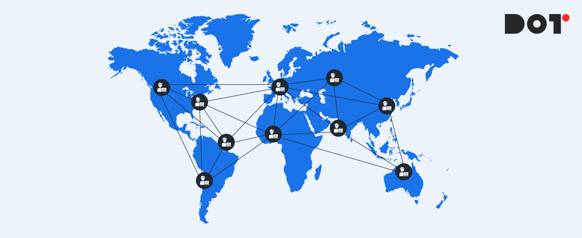
Data science outsourcing offers businesses that collect vast amounts of data—from customer interactions to operational processes—a smart, practical solution. Making sense of this data to find useful insights requires specialized skills and tools. By outsourcing data science, companies can access expert help without needing to hire or build their own in-house team.
Data science outsourcing means working with outside experts or agencies to handle things like analyzing data, building predictive models, or using machine learning. Instead of hiring and training your own data scientists, you can partner with professionals who already have the skills and tools needed. Since 2019, Dot Analytics has been offering data science outsourcing services, helping businesses turn their data into useful information.
Right now, we’re working on an exciting project that predicts Return on Marketing Investment (ROMI) from any type of ad traffic—whether it’s from large platforms like Google or independent media publishers. This helps businesses understand how well their marketing dollars are being spent across a variety of sources.
Outsourcing data science offers several important benefits, including:
- Cost savings: You avoid the high costs of building an internal team and buying expensive tools.
- Access to top experts: You can work with data specialists who already have the right skills and knowledge.
- Faster insights: External experts can quickly analyze your data and provide valuable recommendations.
- Quick project start: You don’t need to wait to set up a big team. With outsourcing, the project can start right away.
By outsourcing data science, companies can focus on what they do best while still using data to drive their success. It’s a simple, effective way to stay competitive in today’s data-driven world.
Understanding Data Science Outsourcing
Definition and Scope
Data science outsourcing is when businesses partner with external experts or agencies to handle data-related tasks. These tasks can range from basic data processing to advanced projects like building predictive models, machine learning algorithms, and data visualizations.
The scope of data science outsourcing typically covers:
- Analyzing large datasets to uncover trends and insights
- Developing predictive models to forecast outcomes like customer behavior or sales trends
- Clustering and segmenting data for more informed decision-making
- Personalizing marketing strategies based on data insights
At Dot Analytics, we have specialized in handling big data projects in the marketing and product-related fields over the past few years. Our focus has been on predictive models, clustering, customer segmentation, and personalized marketing strategies. These types of projects help businesses improve their marketing effectiveness and optimize product offerings by leveraging real-time, data-driven insights.
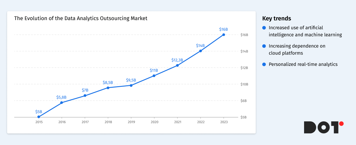
Evolution and Market Trends
The data analytics outsourcing market has seen rapid growth over the past decade. Initially, only large companies with extensive resources could build in-house data science teams, but now companies of all sizes can take advantage of external data expertise through outsourcing. The increasing volume and complexity of data have made data science outsourcing a practical, cost-effective solution for many organizations.
Key trends in the data analytics outsourcing market include:
- Greater use of artificial intelligence and machine learning in outsourced projects, helping businesses automate processes and extract faster insights from data.
- A growing reliance on cloud-based platforms for scalable and efficient data storage and analysis.
- A focus on personalized and real-time analytics, enabling businesses to respond quickly to market shifts and customer demands.
By tapping into the data analytics outsourcing market, businesses can access cutting-edge technologies and talent without the overhead of maintaining an internal team. This allows them to stay competitive, agile, and data-driven in an increasingly fast-paced business environment.
Key Benefits of Data Science Outsourcing
Access to Specialized Expertise
One of the main advantages of data science and data analytics outsourcing is gaining access to skilled professionals with specialized knowledge. These experts have experience in various industries and can handle complex tasks that might be challenging for an in-house team.
For example, tasks like predictive analytics outsourcing allow businesses to forecast future trends based on data. At Dot Analytics, we’ve helped companies develop predictive models to anticipate customer behavior, optimize marketing campaigns, and improve product recommendations. By outsourcing these tasks, businesses can tap into expertise in areas like AI outsourcing and cloud data services without the long process of hiring and training new staff.
Cost-Effectiveness
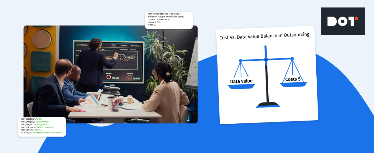
Outsourcing data science can significantly reduce operational costs. Building an in-house team involves expenses like salaries, benefits, training, and investing in necessary tools and technologies. These costs can add up quickly, especially for small and medium-sized businesses.
In contrast, data analytics resource outsourcing allows companies to pay for only the services they need when they need them. There’s no need to invest in expensive software or infrastructure. For instance, hiring a full-time data scientist can be much more costly than outsourcing the same tasks to an external partner like Dot Analytics. This approach frees up budget resources for other critical areas of the business.
Scalability and Flexibility
Business needs can change rapidly, and data projects often require scaling up or down quickly. Outsourcing provides the flexibility to adjust the level of resources dedicated to a project as needed.
For example, if a company wants to expand its web data analytics outsourcing during a peak season, an outsourcing partner can easily allocate more experts to handle the increased workload. Conversely, during slower periods, services can be scaled back to reduce costs. This level of adaptability is hard to achieve with an in-house team, where staffing levels are more fixed.
Faster Time to Market
Outsourcing data science accelerates project completion and helps businesses get to market faster. External experts are already equipped with the necessary tools and experience to start working immediately.
Consider a company that wants to launch a new product and needs data insights to guide its strategy. Building an in-house team could take months of recruiting and training. By outsourcing to specialists like Dot Analytics, the project can start right away, reducing time to market and gaining a competitive edge.
Focus on Core Activities
By outsourcing tasks like business intelligence outsourcing, businesses can concentrate on their core activities. Managing complex data projects internally can divert attention and resources away from primary business functions.
For example, a retail company might prefer to focus on sales and customer service rather than data analysis. By partnering with an outsourcing provider, they can receive valuable insights without stretching their internal resources thin. This leads to improved overall efficiency and better business outcomes.
Access to Advanced Technologies
Outsourcing partners often have access to the latest tools and technologies in data analytics. They invest in cutting-edge software and platforms to deliver the best results for their clients.
Using advanced technologies like AI outsourcing and cloud data services can enhance data processing, analysis, and visualization. For instance, at Dot Analytics, we utilize state-of-the-art machine learning algorithms and big data platforms to handle complex datasets. Businesses benefit from these technologies without having to invest in them directly.
Ensuring Compliance and Security
Data compliance and security are critical concerns in today’s business environment. Outsourcing partners are well-versed in industry standards and regulations to ensure that data is handled properly.
They implement robust security measures to protect sensitive information. For example, compliance with standards like GDPR or HIPAA requires specialized knowledge. An experienced outsourcing provider can navigate these requirements, giving businesses peace of mind that their data is secure.
Fresh Perspectives and Innovation
Bringing in external experts can introduce new ideas and innovative approaches to solving problems. Outsourcing partners work with a variety of clients and industries, allowing them to apply best practices and creative solutions.
For example, an outsourcing team might suggest a novel way to segment customers or a new method for predicting market trends. This fresh perspective can lead to innovative solutions that an internal team might not have considered.
By leveraging data science and data analytics outsourcing, businesses can access specialized expertise, reduce costs, scale projects efficiently, and gain a competitive advantage. Partners like Dot Analytics offer the tools, knowledge, and flexibility needed to make the most of data in today’s dynamic market. Whether it’s predictive analytics outsourcing or utilizing cloud data services, outsourcing provides a pathway to enhanced performance and growth.
Challenges and Risks of Data Science Outsourcing
Potential Risks
While outsourcing data science offers numerous benefits, it’s important to be aware of potential challenges that may arise. Common risks include:
- Data Privacy and Security Concerns: Sharing sensitive data with an external partner can raise worries about confidentiality and the possibility of data breaches.
- Communication Issues: Differences in time zones, language barriers, or cultural misunderstandings can lead to miscommunication and project delays.
- Quality Assurance: Ensuring that the outsourced work meets your company’s standards and expectations can be challenging without proper oversight.
- Dependency on the Outsourcing Partner: Relying heavily on an external provider might make you vulnerable if the partner faces issues or if the partnership ends.
Mitigation Strategies
To address these challenges and ensure a successful outsourcing experience, consider the following strategies:
- Establish Strong Legal Agreements: Begin all projects with clear contracts and Non-Disclosure Agreements (NDAs) to protect your data and intellectual property. At Dot Analytics, we start every project with NDA terms, ensuring that your sensitive information remains confidential.
- Choose a Reputable Partner: Select an outsourcing provider with a solid track record and positive client testimonials. With six years of experience, Dot Analytics has built a reputation for reliability and data privacy. Many of our satisfied customers can attest to our commitment to trust and security.
- Implement Clear Communication Channels: Set up regular meetings and updates to keep everyone on the same page. Use collaborative tools and establish clear points of contact to minimize misunderstandings.
- Define Expectations Clearly: Outline project goals, timelines, deliverables, and quality standards from the outset. This ensures that both parties have a mutual understanding of what is expected.
- Ensure Compliance and Security Measures: Verify that your outsourcing partner follows industry-standard security protocols and complies with relevant regulations. Ask about their data handling practices and certifications.
- Start with a Pilot Project: Begin with a smaller project to assess the outsourcing partner’s capabilities before committing to larger, long-term engagements.
By being proactive and taking these steps, you can mitigate the risks associated with data science outsourcing. Partnering with a trusted provider like Dot Analytics allows you to focus on your core business activities, confident that your data projects are in capable and secure hands.
How to Choose the Right Data Science Outsourcing Partner
Selecting the right partner for data science outsourcing is crucial for the success of your projects. Here’s what to consider and a step-by-step guide to help you make the best choice.
Key Criteria
Expertise and Experience
Look for a partner with proven experience in data analytics outsourcing. They should have a solid track record in handling projects similar to yours. Whether you need web data analytics outsourcing to improve your online presence or machine learning outsourcing to develop predictive models, the partner should demonstrate expertise in these areas.
Technical Skills
Ensure the partner is proficient in the latest technologies and tools related to data science. This includes skills in data engineering outsourcing, where they manage and optimize your data pipelines, and offering comprehensive data consulting services to guide your strategies.
Industry Knowledge
A partner familiar with your industry can better understand your specific challenges and needs. This ensures they can provide solutions tailored to your business goals.
Communication and Collaboration
Effective communication is key to a successful partnership. The outsourcing partner should be responsive, transparent, and willing to work closely with your team. This helps prevent misunderstandings and keeps the project on track.
Reputation and References
Research the partner’s reputation. Look for client testimonials, case studies, or reviews. A company like Dot Analytics, with years of experience and positive feedback, can be a reliable choice.
Data Security and Compliance
Data privacy is critical. Ensure the partner has robust security measures in place to protect your sensitive information. They should comply with relevant regulations and be willing to sign confidentiality agreements.
Evaluation Process
1. Define Your Needs
Start by identifying what you want to achieve. Do you need web data analytics outsourcing to analyze website traffic and user behavior? Or perhaps machine learning outsourcing to create models that predict customer trends? Clearly defining your goals will help you find a partner that meets your specific needs.
2. Research Potential Partners
Create a list of potential partners specializing in data analytics outsourcing. Look for those offering the services you require, such as data consulting services or data engineering outsourcing.
3. Assess Expertise and Experience
Review the partners’ portfolios and case studies. Check if they have experience in your industry and have handled projects similar to yours. For example, if you need machine learning models, ensure they have successfully implemented such solutions before.
4. Evaluate Communication Skills
Arrange meetings to gauge their communication style. They should be able to explain complex concepts in simple terms and be open to your questions and feedback.
5. Check References and Reviews
Ask for references or look for reviews from previous clients. This can provide insights into their reliability, quality of work, and ability to meet deadlines.
6. Discuss Data Security Measures
Ensure the partner has strong data security practices. They should be transparent about how they protect data and comply with regulations. This is especially important when dealing with sensitive information.
7. Consider Cultural Fit
A good cultural fit can make collaboration smoother. Consider their work ethics, values, and approach to problem-solving to see if they align with your company’s culture.
8. Start with a Pilot Project
Before committing to a long-term partnership, consider starting with a small pilot project. This allows you to assess their performance and determine if they are the right fit.
By carefully evaluating potential partners based on these criteria, you can choose a data science outsourcing partner who will help your business thrive. Whether it’s through data consulting services, machine learning outsourcing, or data engineering outsourcing, the right partner can provide the expertise and support you need to make the most of your data.
Case Studies: Success Stories of Data Science Outsourcing
Predictive Model for ROMI in the iGaming Industry
An online gaming company aimed to optimize its marketing budget by predicting the Return on Marketing Investment (ROMI) across various advertising channels. They decided to outsource this project to Dot Analytics to leverage specialized expertise in predictive analytics.
Solution: Dot Analytics developed a predictive model using machine learning algorithms, including XGBoost and several other advanced models. These algorithms analyzed data from different ad sources, covering both major platforms and independent media publishers. By considering factors like user engagement, conversion rates, and historical performance, the models provided highly accurate forecasts of the expected ROMI for each advertising channel.
Result: With insights from the predictive models, the company was able to allocate its marketing budget more effectively. They increased spending on channels with higher predicted returns and reduced investment in less effective ones. This strategic reallocation led to a significant increase in overall ROMI, maximizing the impact of their marketing efforts without increasing the total budget.
Clustering for Personalized Marketing in E-Commerce
An e-commerce retailer faced challenges with customer retention and a high cart abandonment rate. To address this, they outsourced their data science project to Dot Analytics to gain deeper insights into customer behavior.
Solution: Dot Analytics performed clustering analysis on the retailer’s customer data. By grouping customers based on purchasing habits, browsing behavior, and preferences, they identified distinct segments within the customer base. This allowed the retailer to tailor personalized marketing campaigns for each segment.
Result: The personalized approach led to improved customer engagement. Customers received relevant product recommendations and offers, which increased their likelihood of completing purchases. The retailer saw a noticeable decrease in cart abandonment and an increase in repeat customers, boosting overall sales and customer loyalty.
Lessons Learned
- Access to Expertise Leads to Better Solutions: Outsourcing allowed these companies to tap into specialized skills and knowledge that they didn’t have in-house. Dot Analytics provided expert solutions that directly addressed each company’s unique challenges, utilizing advanced models like XGBoost to achieve high prediction accuracy.
- Personalization Enhances Customer Experience: Using data to understand customers on a deeper level enabled more effective marketing strategies. Personalized campaigns led to higher engagement and loyalty.
- Predictive Analytics Improves Decision-Making: Implementing predictive models helped companies make informed decisions about budget allocation and marketing strategies, leading to cost savings and increased revenue.
- Outsourcing Accelerates Project Completion: By partnering with Dot Analytics, these companies avoided the time and resources needed to build internal teams. This resulted in faster implementation of solutions and quicker realization of benefits.
These success stories highlight how data science outsourcing can drive significant business improvements. By collaborating with a trusted partner like Dot Analytics, companies can leverage advanced analytics and machine learning models to solve complex problems, enhance customer experiences, and achieve strategic goals.
Summary of Key Points
Outsourcing data science brings several key benefits:
- Access to Expertise: Gain specialized skills without the need to hire and train your own team.
- Cost Savings: Reduce expenses related to staffing and technology investments.
- Scalability: Easily adjust resources based on your project’s needs.
- Speed: Accelerate project completion and get to market faster.
- Focus: Allow your team to concentrate on core business activities.
- Advanced Technology: Leverage cutting-edge tools and methodologies.
- Security: Trusted partners ensure data privacy and compliance.
- Innovation: Introduce fresh perspectives and creative solutions.
Consider Outsourcing Your Data Science Needs
By outsourcing your data science projects, you can unlock valuable insights and drive your business forward without the complexities of managing everything in-house. Partners like Dot Analytics offer the expertise and resources to help you make the most of your data.
Data Analytics Reporting in 2024: How to Get Data Analysis Reports in 9 Steps
What is data analytics reporting
Data analytics reporting creation is the process of generating reports that allow businesses to quickly gain valuable insights. For example, in the past, marketers had to manually download data from advertising platforms, combine it with sales or lead information, perform calculations, and only then present the results to management or make decisions based on this data. This is a very time-consuming process that requires a significant amount of time from specialists and increases the risk of errors.
Data analytics and reporting help marketers, product owners, and analysts to organize vast amounts of information and focus on what really matters to the business. By utilizing business intelligence insights and dashboard creation tools, you can streamline the reporting process, making it more efficient and less prone to errors. This article will show you how to optimize the reporting process so you can create effective reports.
Why is this important?
There have been cases where PPC specialists manually downloaded data from Google Analytics, Google Ads, Meta Ads, and CRM systems, then combined it in Excel or Google Sheets. This could take up to 12 hours of work time. However, automating the reporting process not only frees up time to focus on key tasks but also ensures the stability and quality of the reports. A specialist may fall ill, go on vacation, or leave the company, which makes manual reporting extremely vulnerable. By leveraging dashboard creation tools and business intelligence insights, automated systems solve these problems by providing a continuous and efficient data analysis process.
The Importance of Data Analytics Reporting
The importance of data analytics reporting for businesses cannot be overstated. Clear and accessible reports significantly simplify decision-making processes, allow businesses to identify growth areas, detect issues in processes or products, and adjust strategies for positioning goods or services. By utilizing effective data visualization techniques and advanced reporting software solutions, businesses can ensure that their reports are not only comprehensive but also easy to understand.
For instance, a retail company had a standard website and a mobile app where customers could make purchases and interact through marketing tools, building customer profiles. However, the company lacked a clear understanding of what exactly was happening within the app. Unlike the website, the app posed new challenges in tracking user behavior and improving the customer journey. The problem was that tracking methods in a web environment and a mobile app were fundamentally different.
The company had a solid grasp of what was happening on the website, using data analytics reporting to optimize advertising campaigns and manage inventory. However, they didn’t have the same level of understanding when it came to the mobile app.
Interactive reporting, which combined sales data with CRM systems, analytics tools like Adjust, Firebase, Crashlytics, and advertising platforms, allowed for in-depth analysis of the app’s impact on sales. Thanks to interactive dashboards that utilized real-time information on installations, sales, and user activity, along with powerful reporting software solutions, the company was able to discover new ways to engage users and enhance their experience within the app using innovative data visualization techniques.
Essential Steps for Effective Data Analytics Reporting
Key Steps for Effective Data Analytics Reporting
Step 1: Define goals and objectives.
First and foremost, it’s important to clearly understand what you aim to achieve with your dashboards. For example, if your goal is to improve PPC advertising, SEO, or lead generation, you should develop a visualization that highlights which channels perform better and provide the highest return on investment for every dollar spent. Using the right data analytics reporting tools can help you visualize these insights effectively.
Step 2: Data collection and validation.
Without high-quality data, it’s impossible to generate accurate insights. It’s essential to ensure the data is accurate and up-to-date. For example, check the data for duplicates or missing values, incorrect symbols that complicate data usage, and misleading entries. Clean and accurate data is vital for analytical decision-making, enabling you to draw actionable insights.
Step 3: Choose the right tools and software.
Today, there are many data analytics reporting tools available, such as Tableau, Power BI, and Google Data Studio. The choice of tool depends on your needs and technical capabilities. For example, if you need a tool for interactive data visualization, Power BI could be a great choice, while Google Data Studio is well-suited for integration with other Google products. Choosing the right tool ensures that your reporting supports analytical decision-making effectively.
Step 4: Data Analysis Techniques
There are a few key techniques that data analysts rely on. The first is descriptive analysis, where we use statistics or visualizations like graphs and tables to see what’s happening in the data—giving us a clear view of key trends and any anomalies. Next is diagnostic analysis, which digs deeper to uncover the reasons behind those trends or issues. After that comes predictive analysis, where we use models to forecast future events based on historical data. Choosing the right data collection methods is also crucial for accurate and insightful analysis, ensuring your data reporting and analytics efforts are reliable and actionable.
Step 5: Visualization and Presentation
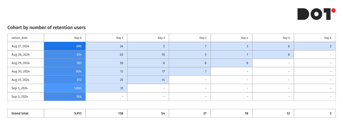
Good data visualization is what turns reports into clear and actionable insights. If you’re tracking trends over time, line charts are ideal for visualizing those changes. For comparing categories, bar charts make it easy to spot which one stands out. When analyzing historical data, especially user behavior or purchases, cohort analysis built using pivot tables can reveal valuable patterns. For detailed product assortment analysis, tables are essential since they offer in-depth data for each item. Using the right data analytics reporting tools not only enhances clarity but also ensures that your data reporting and analytics are precise and effective.
Step 6: Turning Data into a Story
One of the key aspects of reporting in data analytics is transforming dry numbers and facts into a compelling and understandable narrative. This isn’t just about analyzing data—it’s about showing the causes and effects so report users can see the bigger picture behind the numbers. Start with a problem or question, use the data to explore it, and then conclude with recommendations or findings. This approach is particularly important when working with predictive analytics models or explaining key performance indicators (KPIs) to stakeholders.
Step 7: Review and Refinement
Reports should have version control to ensure accuracy and relevance. Once a report is created, it’s important to review it and gather feedback. For instance, we use DBT and GitHub for building reports, allowing us to track changes and refine the report to address more questions and improve accuracy. This process is crucial when using statistical analysis software to identify and correct potential issues, ensuring the report is more reliable and informative.
Step 8: Implement Feedback and Update Regularly
Feedback is essential for improving your reports, but it’s equally important to keep them updated as new data or changes in the business emerge. If your company starts using a new marketing channel, for example, you need to incorporate that data into future reports to ensure your key performance indicators (KPIs) stay relevant. Likewise, regularly update your reports to reflect any new insights from predictive analytics models to keep them aligned with current business goals.
Step 9: Security and Distribution
Don’t forget to secure your reports. Use encryption and limit access to confidential data. For distributing reports, ensure you’re using secure platforms like Tableau, Looker, or Power BI to safely share insights with the right stakeholders. Secure distribution is critical in maintaining the integrity of reporting in data analytics.
Advanced Tips and Tricks
Artificial Intelligence and Machine Learning in Reporting
Artificial intelligence (AI) and machine learning (ML) can automate reporting processes and significantly improve their accuracy and efficiency. Instead of manually analyzing large datasets, you can leverage Python libraries such as TensorFlow or Scikit-learn to automatically detect key trends, anomalies, and correlations in your data. Additionally, using platforms like BigQuery ML allows you to perform real-time analysis at scale, processing massive amounts of data with speed and precision. This is particularly beneficial when working with dynamic datasets, such as real-time customer behavior or marketing performance data.
Several common ML models can be applied in real business scenarios:
- K-Means Clustering – Used for customer segmentation by grouping customers with similar behaviors. This helps marketers create personalized campaigns for each segment.
- Logistic Regression – Useful for predicting customer churn, helping businesses identify which customers are at risk of leaving, allowing timely intervention.
- Collaborative Filtering – This model powers recommendation engines, suggesting products or services based on customer preferences and behaviors, enhancing personalization.
- Time Series Forecasting (ARIMA, Prophet) – Ideal for sales forecasting and predicting seasonal trends, enabling more accurate planning and inventory management.
- XGBoost – A popular algorithm for predicting ad performance, allowing marketers to optimize campaigns by predicting which ads will result in conversions or high engagement.
Machine learning can also assist in predictive analytics, offering actionable insights by forecasting future trends based on historical patterns. For instance, if you’re a marketer aiming to predict which campaigns will deliver the highest ROI next month, ML algorithms can analyze prior performance, consumer behavior, and external factors to generate accurate predictions. This helps optimize your marketing strategy, ensuring you allocate budgets effectively and maximize returns. Moreover, ML models can continuously learn from new data, making future predictions even more precise over time.
By integrating AI and ML into your reporting processes, you not only save time but also gain deeper insights that would be difficult to uncover through traditional methods. This makes data-driven decision-making more reliable and scalable, helping businesses stay ahead of the competition
Common Pitfalls in Data Analytics Reporting and How to Avoid Them
Data Analytics Reporting can be challenging, and even experienced professionals sometimes make mistakes.
- Incorrect or incomplete data: One of the most common issues is using data that contains errors, duplicates, or missing values. This can lead to incorrect conclusions and decisions.
- Misalignment of reports with business goals: Reports often do not align with the actual needs of the business, either including too much information or being too complex to understand.
- Poor data visualization: Using complex charts or overloaded diagrams can make reports difficult to comprehend. Choose simple and clear visual elements to effectively convey key insights.
Best Practices
- Data validation: Ensure that the data is accurate and complete before starting the analysis.
- Clear objectives: Define specific questions that the report should address.
- Simple visualizations: Select charts that are easy to understand and that clearly reflect the main insights.
- Feedback: Gather feedback from report users and improve them accordingly.
- Continuous updates: Regularly update reports to reflect new data and changes in the business
Case Studies and Success Stories
Example of One of Our Clients – A Marketing Campaign in the E-Commerce Sector
Company and Product:
One of the leading players in the e-commerce sector, specializing in the sale of household appliances and electronics, faced the challenge of optimizing their advertising campaigns. The company offered a wide range of products, from smartphones to kitchen appliances, and spent significant resources on advertising across various channels. However, they lacked a clear understanding of which of these channels actually generated the most revenue.
Challenges:
Before implementing the new reporting system, the company relied on fragmented data from separate ad accounts, making it difficult to assess the true effectiveness of their campaigns. The lack of integration with the CRM system prevented them from accurately tracking the real ROAS and linking advertising costs to actual sales. Additionally, there was no data quality assurance in place, which led to unreliable insights and hindered effective decision-making.
Solution:
To address these challenges, the company, with our assistance, decided to implement a new reporting system using cloud-based reporting platforms. This system included the development and implementation of the following reports:
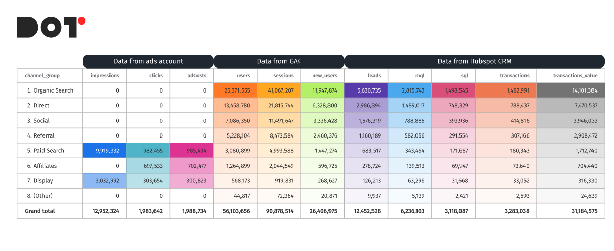
- Main KPI Report: This report enabled the integration of data from various ad accounts and the CRM system, allowing the company to see the full picture of their advertising campaign performance. With improved data quality assurance, they could calculate the true ROAS by taking into account all costs and revenues associated with advertising activities. This allowed them to make more informed decisions and enhance their overall business analytics strategies.
A significant portion of the profit growth was directly related to this report, as it enabled the company to adjust campaigns based on the actual effectiveness of each. The client realized that many of their Meta Ads campaigns did not have a sufficient ROAS, whereas it became clear that they needed to increase the budget for Google Ads PMax campaigns. Additionally, the Apple Search and UAC campaigns showed a good LTV, making it profitable to invest in acquiring new app users. - RFM Model for Email Marketing: The use of an automatic RFM model (Recency, Frequency, Monetary) allowed the company to better engage with their audience by segmenting customers based on their behavior. This enabled the setup of personalized email campaigns, improving their effectiveness and increasing repeat purchases.
- Cohort Analysis of Traffic Quality: Cohort reports gave the company the ability to evaluate the quality of traffic by tracking the behavior of users who interacted with their website during different time periods. This helped them understand which campaigns were bringing in more loyal customers who made repeat purchases.
- MCF Report (Multi-Channel Funnels): This report helped the company track the customer journey to purchase across various advertising channels, including the length of the contact chain with ads. They were able to understand which combinations of channels worked best and how to optimize the sequence of actions for maximum impact.
Results:
Thanks to the implementation of the new reporting system using cloud-based reporting platforms, the company significantly improved the effectiveness of their advertising campaigns. They discovered that ads on one platform, particularly Instagram, generated the highest conversion rates. This allowed them to reallocate their advertising budget, leading to a 25% increase in profits in just a few weeks.
Additionally, audience segmentation using the RFM model improved the effectiveness of email marketing, while cohort analysis and MCF reports provided deeper insights into traffic quality and channel performance. As a result, the company was able to reduce spending on less effective channels and increase overall return on investment (ROI). The incorporation of data quality assurance measures also ensured that all future insights were reliable and actionable, supporting their long-term business analytics strategies.
Conclusion and Next Steps
Mastering data analytics reporting is essential for any company looking to optimize marketing efforts and boost profitability. Key steps like setting clear goals, gathering and validating data, choosing the right tools, analyzing and visualizing insights, and constantly improving reports can turn your data into a powerful decision-making tool. By implementing automated reporting models and real-time data analysis, businesses can uncover deeper insights and react to changes faster.
Now that you’re familiar with these strategies, it’s time to put them into practice. Adopting these methods will help your business cut costs, increase revenue, and drive consistent growth.If you need assistance setting up a robust reporting system or want to tap into our specialized data analytics services, feel free to reach out – dotanalytics.ai. Our experts are ready to help take your business to the next level with cutting-edge data solutions.

Data Analytics Integration: Combining Insights From Multiple Sources
What is Data Analytics Integration and Why It Matters
Data integration is the process of combining data from different sources into one place, such as a visualization system. It involves gathering data from CRM, advertising platforms, and other business tools to unify and use them as a homogeneous data set.
This unification allows for the seamless use of data in contexts necessary for the business. For instance, marketers don’t need to spend time consolidating data from Google Ads, Meta Ads, Google Analytics, CRM, Pinterest Ads, and other platforms into one place. Thus, data integration and analytics relieve employees from manual data consolidation, allowing them to focus on data integration analytics and decision-making.
The data integration process usually involves several key steps:
- Data Collection: Gathering data from various sources.
- Data Cleaning: Removing duplicates, correcting errors, and standardizing data formats.
- Data Transformation: Converting data according to the system requirements where it will be loaded.
- Data Loading: Loading data into a central repository or visualization system. Here, data is organized for easy analysis. Modern visualization systems like Tableau, Power BI, or Google Data Studio enable creating interactive reports and dashboards, aiding in the visualization and analysis of integrated data.
Data integration provides companies with a comprehensive view of their business processes, enabling them to analyze the effectiveness of marketing campaigns, track customer behavior, and make informed decisions based on comprehensive information. It also enhances forecast accuracy, optimizes business processes, and improves customer interactions.
Explaining Data Analytics Integration Processes
Integration Techniques
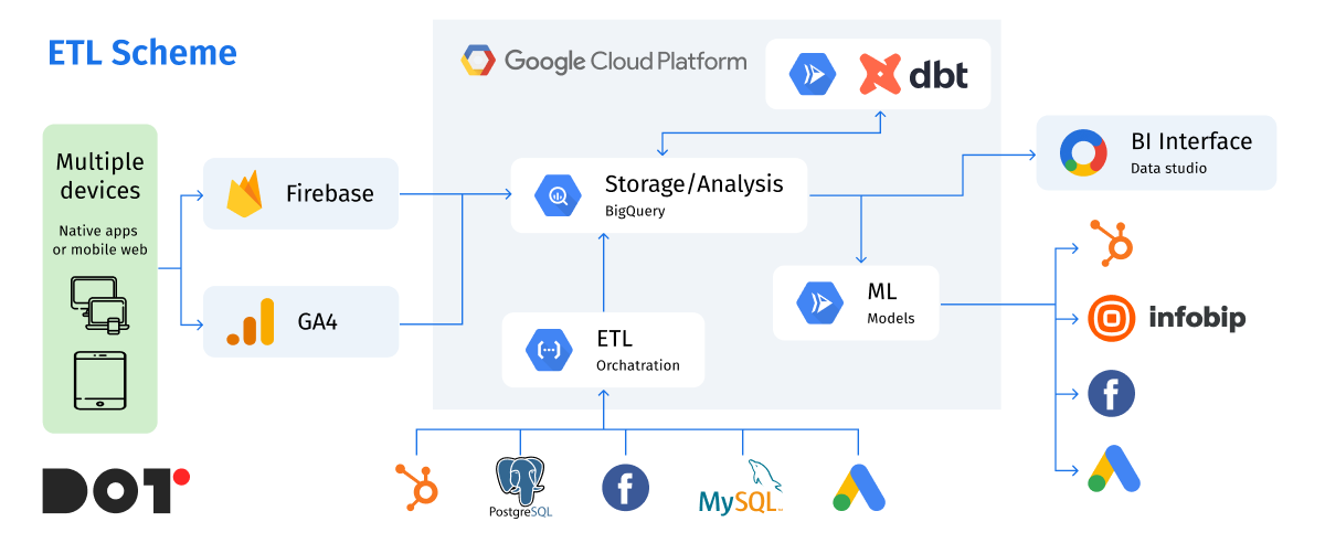
Data integration is a key element for effective business management, especially when it comes to analysis and decision-making. Let’s explore various data integration methods, such as ETL processes, API integration, and real-time data streaming, with specific examples.
First Step: Data Collection from Various Sources
Imagine we need to simplify a marketer’s work with reporting, data, and ad performance to speed up decision-making. Here’s how it can be done using different data integration methods.
Native Connectors
For example, data from Google Ads can be collected using a native connector from Google Ads to BigQuery. This greatly simplifies maintenance and ensures automatic data flow without additional setup. No coding is required, as everything is configured through the interface.
API Integration
For other services, such as Meta Ads or other advertising tools that do not have direct connectors to your data warehouse (DWH), API integration is used. This method is more time-consuming but allows you to collect exactly the data you need. For instance, you can gather data on clicks, impressions, and conversions, perform basic transformation and cleaning before loading. This is called ETL (Extract, Transform, Load).
ETL Implementation
The ETL process allows data collection using a programming language, such as Python. You can write a script that extracts data from the API, processes it (e.g., transforms date formats, cleans unnecessary characters), and loads it into the data warehouse. This can be useful when specific data transformations or merging information from different sources is needed.
Real-Time Data Streaming
Another type of data collection is real-time streaming. For instance, Google Analytics 4 has an intraday table that collects information in real time and transmits it to the DWH. This method is suitable for applications where up-to-date data is crucial, such as tracking user activity on a website or in a mobile app.
Using ETL Services
There are also ETL services that use their own scripts to collect data and transfer it to your DWH, such as BigQuery or Amazon Redshift. For example, platforms like Fivetran or Stitch can automate the integration process, reducing the need for manual coding and allowing quicker implementation of solutions.
By understanding and utilizing these data integration techniques, businesses can streamline their data management processes, enabling more efficient analysis and decision-making. This not only saves time but also enhances the accuracy and reliability of the insights derived from the data.
Real-Life Examples
Small Business
- Platform: Fivetran
- Situation: A small business wants to integrate data from a website form and CRM. Fivetran automates data transfer without the need for coding.
Medium Business
- Platform: Google Data Studio
- Situation: A medium-sized company collects data from Google Ads, Meta Ads, and its website. Using Data Studio, they can create reports and dashboards for the marketing team.
Large Business
- Platform: Apache NiFi
- Situation: A large corporation integrates data from various departments and external partners, processing large volumes of data in real-time for analytical purposes.
Factors Affecting Data Integration Complexity and Cost
Data integration is a crucial process for many organizations, but its complexity and cost can vary significantly depending on several key factors. Let’s examine the main ones.
Volume and Variety of Data
The volume and variety of data greatly impact integration strategies and costs. The more data that needs to be processed, the more resources are required for storage, processing, and transfer. For instance, large data volumes require powerful servers and complex systems for processing, increasing the costs of storing and managing such data.
Data variety also adds complexity since data can come in different formats. Integrating various types of data requires different methods and tools for transforming and combining them into a unified system. This necessitates additional expenses for developing and maintaining the necessary tools.
Variability of Data Sources
Integrating data from different sources can be very challenging, especially when dealing with legacy systems. Older systems often lack modern APIs or standard data formats, complicating the process of extracting and processing data. Such systems may require the development of special connectors or the use of intermediary software for integration, raising the overall cost.
On the other hand, modern applications typically have well-documented APIs and support standard data exchange protocols, simplifying the integration process significantly. However, even in these cases, ensuring compatibility and optimizing the data processing workflow from various sources can present challenges.
By understanding these factors, organizations can better plan and manage their data integration projects, balancing complexity and cost effectively.
Current Trends and Technologies in Data Integration
Data Integration is constantly evolving, incorporating new technologies and approaches to make the process more convenient and efficient. In recent years, major innovations have included cloud integration platforms and AI-powered tools.
Cloud Integration Platforms
Cloud integration platforms, such as Amazon Web Services (AWS), Google Cloud Platform (GCP), and Microsoft Azure, are gaining popularity due to their flexibility, scalability, and cost-effectiveness. These platforms offer integration services that allow connecting various data sources, automating ETL processes, and ensuring seamless real-time data flow. For example, AWS Glue and Google Cloud Dataflow facilitate data integration by automating many steps of the process.
AI-Powered Tools
Artificial intelligence is starting to play a significant role in data integration. AI-powered tools can automatically detect, correct, and transform data, significantly reducing the time and effort required for integration. Platforms like Informatica and Talend incorporate AI to improve data quality, automatically detect anomalies, and optimize data transformation processes. They can also predict data needs and automate solutions, enhancing work efficiency.
Market Analysis
Trends in the adoption of data integration technologies indicate a rapid growth in the popularity of cloud platforms and AI solutions. More companies are switching to cloud data services due to their flexibility and scalability. According to research, the cloud integration platform market is expected to grow significantly in the next few years, with a projected annual growth rate of over 20%.
AI-powered tools are also showing rapid growth as companies increasingly recognize their value in improving data quality and automating complex processes. By 2025, more than 60% of large companies are expected to use AI for data integration and analytics.
Future Predictions
In the future, data integration will be even more closely linked with innovations in cloud computing and AI. The demand for solutions providing real-time data integration, such as streaming platforms (e.g., Apache Kafka) and tools for working with Big Data, is expected to grow.
Additionally, further developments in self-learning data integration systems are anticipated. This means that integration platforms will become more autonomous, capable of adapting to changes in data sources and business requirements without manual intervention.
By keeping up with these trends and technologies, businesses can stay ahead in data management, ensuring efficient and effective integration processes that support their analytical and decision-making needs. Utilizing APIs in data integration will further streamline the process, enhancing overall efficiency.
Strategies for Efficient Data Integration
Cost-Effective Integration Practices
For modern companies involved in marketing, E-commerce, and SAAS, integrating data from various sources like Google Ads, Meta Ads, CRM systems, and others into a single place is crucial. Utilizing tools like dbt (Data Build Tool) and Google BigQuery or other data warehouses (DWH) can reduce costs and enhance data processing accuracy.
Using dbt and Google BigQuery
dbt and Google BigQuery are powerful tools for processing and storing large volumes of data. dbt allows transforming incoming data from external sources into an analysis-friendly format. Using BigQuery for data streaming ensures fast and scalable data storage.
Data Quality Verification
dbt has a built-in data quality check mechanism that simplifies the processing and loading of data, saving money by processing only trusted data. Through table orchestration in dbt, companies can avoid errors that occur during partial data loads. For example, if one table loads successfully while another does not, this previously caused data errors. Now, dbt prevents such issues.
Combining Data from Various Sources
Combining data from Google Ads, Meta Ads, and CRM into BigQuery creates a centralized data repository. This simplifies the analysis process and enables more accurate and comprehensive results. With dbt, the data loading and transformation process can be automated, reducing the need for manual labor and minimizing the likelihood of errors.
Table Partitioning to Save on Processing Costs
Table partitioning in BigQuery is a key feature for optimizing costs and improving data processing efficiency. Partitioning allows breaking down large tables into smaller parts, significantly reducing query time and processing costs. This is particularly useful for large volumes of data coming from various advertising platforms and CRM systems.
By implementing these strategies, companies can achieve efficient and cost-effective data integration, leading to better decision-making and streamlined business processes.
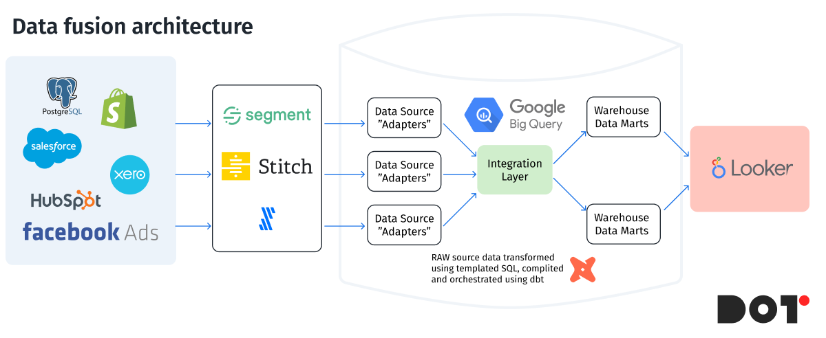
Our Approach to Data Analytics Integration
Utilizing the Full Functionality of dbt
Our approach is based on leveraging the full capabilities of dbt. dbt macros allow creating a scalable and simple naming system, enabling dataset creation and data recording from the console. This provides flexibility and efficiency in data management, simplifying processes, enhancing data synchronization, and reducing the likelihood of errors.
Using Tags
In our structure, some tables need more frequent updates than others. We use dbt tags to process certain tables separately, which significantly saves costs by applying frequent updates only to necessary tables, reducing overall system load.
Incremental Tables
We actively use partitioned tables and incremental models to save costs and improve efficiency. Partitioned tables break down large data volumes into smaller parts, reducing query processing time and costs. Incremental models work with only new data, adding unique values daily, optimizing processing and storage.
Data Quality Testing
Our dbt tests include checks for data uniqueness and column data type changes. For instance, if `transaction_id` changes from `int64` to `string`, our dbt tests will detect this change and prevent data contamination in the DWH. In case of such changes, the system issues an error for immediate action, ensuring high data quality, reliability, and data governance.
Combining Data from Various Sources
Combining data from Google Ads, Meta Ads, and CRM into BigQuery creates a centralized data repository. This simplifies analysis and allows for more accurate and comprehensive results. Automating data loading and transformation with dbt reduces manual labor and minimizes errors.
Cost Savings with Table Partitioning
Table partitioning in BigQuery is key to optimizing costs and improving data processing efficiency. Partitioning allows breaking down large tables into smaller parts, significantly reducing query time and processing costs. This is particularly useful for large data volumes from various advertising platforms and CRM.
Using Google Cloud
We use Google Cloud Platform to save costs and efficiently utilize available resources. Architecturally, some tools are natively connected to others, saving on connectors and minimizing costs. For example, we use BigQuery and native connectors for Google Ads and GA4, reducing data streaming costs to the DWH. BigQuery also has a native connector to Looker Studio, making data visualization easy and cost-effective.
Summary
Using dbt and BigQuery for data integration and analytics from Google Ads, Meta Ads, and CRM reduces data processing costs by 40%. Built-in data quality verification mechanisms in dbt and partitioned tables in BigQuery ensure efficient and economical processing of large data volumes, making our data integration approach highly effective. Our approach relies on advanced technologies and best practices to ensure high data quality and cost optimization, enabling our clients to receive accurate and reliable results for informed business decisions.
If you need help with data integration and analytics, contact the Dot Analytics team today to learn how we can support your business.
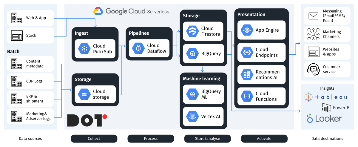
Choosing the Right Data Integration Strategy for Your Business
Firstly, the size of the business plays a crucial role. Small and medium-sized enterprises (SMEs) may need simpler and less costly solutions, while large companies with large data volumes will require more powerful and scalable tools.
For small businesses, where time and basic functionality are more important, focusing on simple, easy-to-integrate products is beneficial. For instance, Google allows nearly free integration of DWH (BigQuery) with APIs (Google Analytics 4, Google Ads, Meta Ads) and other services natively and at no cost. This enables businesses to quickly meet basic data integration needs and simplify decision-making processes.
For medium and large businesses, such an approach might be overly simplistic, where the cost of error is high, and additional tools are needed to make the project structure more complex but more secure. This reduces or prevents the cost of errors.
Using AI systems for anomaly detection and notification, table orchestrators with test systems, notifications, and additional features allow for better tool integration, providing a more stable data integration, cleaning, and visualization system. In the long term, this offers better growth metrics for companies.
Conclusions
Data integration is a critical process for modern companies aiming to gain a comprehensive view of their business processes and make informed decisions. Utilizing tools like dbt and Google BigQuery ensures efficient data processing from various sources, such as Google Ads, Meta Ads, CRM systems, call tracking, and more. This automation reduces costs and enhances analytical accuracy.
At Dot Analytics, we employ advanced technologies and best practices for data integration, enabling our clients to achieve significant success in their respective fields. Our focus is on cost optimization, ensuring high data quality, and creating stable systems for analytics.
We invite you to take advantage of our services and reach new heights in your business. Contact us to learn more about our solutions and how we can help you achieve your goals. Together, we can make your business more efficient and successful.
Reach out to the Dot Analytics team today to start your journey towards better data integration and analytics!
Data Visualization Best Practices: Improve Your Storytelling With Data
In this article, I would like to discuss and showcase the best practices for data visualization and prove that working with tables and charts is not always tedious and time-consuming.
Data Visualization Best Practices: Improve Your Storytelling With Data
A well-designed dashboard should:
- Increase clarity of the current situation, making information easily accessible for the person who will use it (who may not always be deeply involved in the processes), by using understandable graphs, charts, and other visual tools.
- Improve understanding by simplifying complex concepts and relationships, using visual means to convey information faster and more effectively.
- Engage and maintain the audience’s attention (no one wants to look at gray, monotonous, endless tables) with attractive and informative visualizations.
- Aid in data-driven decision-making; the dashboard should answer the user’s questions and display not just dry numbers but patterns and trends that help make decisions based on facts rather than guesses.
Why and When to Use Data Visualization
Data visualization is the process of transforming large numerical datasets into graphical representations, such as charts, graphs, and maps. It plays a crucial role in data analysis by making information more understandable, accessible, and persuasive.
Reasons for using data visualization:
- Enhancing understanding: Visualizing elements allows for quickly conveying the essence of information, highlighting trends, patterns, and relationships that may be unnoticed in textual or tabular formats.
- Improving communication: Effective visualizations can clearly and concisely communicate complex ideas to a broad audience, even those without specialized knowledge.
- Facilitating decision-making: Visual representations of data help analyze information more quickly and make decisions based on facts.
- Increasing engagement: Attractive and informative visualizations can captivate the audience, speeding up and simplifying the process of exploring data.
When it is advisable to use data visualization:
- When working with large volumes of data: Visualization allows displaying large amounts of information in an easily digestible format.
- When comparing data: Graphs and charts enable quicker and easier comparisons of various metrics and identifying differences between them.
- When depicting trends: Data visualization is excellent for showing changes in metrics over time.
- When conveying information to people who are not involved in the processes: Well-designed visualizations do not require specialized knowledge and can be understood by individuals with varying levels of initial understanding.
I can also note that, in some cases, a textual format may be more appropriate, for example, when needing to display and compare qualitative indicators or detailed descriptions. It is essential to choose the data presentation format that best aligns with the goals and objectives.
Crucial Steps to Effective Data Visualization
Before starting to create a dashboard, it is essential to define the specific goals it should address, as this will help ensure that your visualization is relevant and clearly answers the questions posed.
1. Defining Strategic Questions
Each visualization should be built hierarchically, meaning there is one strategic goal being displayed and several metrics related to that strategic goal.
Example: How has our gross income changed in both absolute and percentage terms during the current reporting period, and what factors influenced this?
The goal here is to represent gross income graphically over days/weeks/months (depending on the level of detail needed), with metrics related to the goal, such as: where the income came from (which stores or which traffic sources generated the most), which products were more popular, and the average transaction value.
Also, when creating the visualization, consider the following questions:
- Will the dashboard’s client understand what is depicted?
- What conclusions do I want to convey with this data?
- Will this help make decisions based on this information?
2. Setting Clear and Achievable Goals:
After defining the strategic questions, it is necessary to translate them into clear tasks with specific outcomes you want to see/demonstrate.
When setting tasks, consider the following:
- Clarity of the task: Instead of a vague goal like “understand sales trends,” set a more specific one, such as “identify the top three product categories that led in sales growth during the last reporting period.”
- Link to metrics: How can you determine if the goal has been achieved? You need to highlight key metrics, such as an increase in website traffic or a specific conversion percentage from users to buyers.
- Purpose of the visualization: Do you want them to make a decision, adjust a strategy, or simply gain a deeper understanding?
Examples:
- Poorly defined task: Display data on website traffic.
- Well-defined task: Create a bar chart with a fill for comparing website traffic across different marketing sources/channels to help identify the most effective channel for attracting users.
By defining clear goals, you ensure that your dashboard will not only be visually appealing but also facilitate understanding.
The goal should be the endpoint to orient yourself to at all stages of the dashboard creation process, from choosing metrics to the type of graph used.
3. Know Your Audience
Creating dashboards that are effective requires not only skills in using tools but also an understanding of who you are creating them for.
Whether you are designing a dashboard for colleagues or for a broader audience, it is important to adapt the visual elements and depth of data presentation to your audience’s experience, engagement level, and expectations. Creating a visualization tailored to a specific group will maximize its clarity and engagement.
Assessing Data Engagement and Experience:
- Data Literacy: Understand how well your audience is familiar with reading and interpreting data in your niche/project.
- Experience with Dashboards: Determine how familiar your audience is with various types of tables and graphs and how to interpret them.
- Preferences and Expectations: Consider what visualization formats your audience prefers and what expectations they have for them.
Adapting the Visualization:
- Complexity: Take into account your audience’s data literacy when choosing the complexity of the visualization.
- For less engaged audiences: Use simple charts, such as bar and pie charts, with clear legends and titles.
- For more engaged audiences: You can use more complex visualizations, such as heat maps or scatter plots, assuming the audience will be able to understand them.
- Style: Align with the visual style preferred by your audience.
- For a more formal, business audience: Use a professional and restrained style with a neutral color palette.
- For a younger or more informal audience: Bright colors and creative designs can be utilized.
- If your company has a brand book, dashboards should be created in corporate colors.
- Text: Use language and terminology that are understandable to your audience.
- Avoid using industry-specific terms that may be unfamiliar to your audience.
4. Choose the Right Visualization Tools
Choosing the right visualization tools is crucial for effectively presenting information and achieving the goals of your visualization. There is no one-size-fits-all type of chart that suits every situation. Instead, there are many types of charts and graphs, each of which is better suited for displaying specific data.
1. Choosing the Type of Chart:
For Comparing Data: To compare values across different categories, use bar charts, line charts, or pie charts.
For Displaying Trends: To show changes in metrics over time, use line charts or moving average charts.
For Displaying Relationships: To illustrate the dependencies between variables, use scatter plots or bubble charts.
For Displaying Distribution: To represent the distribution of data, use histograms or density plots.
2. Effective Use of Color, Scale, and Layout:
- Color: Use colors to highlight important data, but try to avoid using too many colors or color combinations that may distract the audience.
- Scale: Choose a scale that allows you to see all the values of your data without distorting them.
- Layout: Arrange the elements of the dashboard in a structured manner, ensuring there is enough space between them.
Recommendations:
- Use one type of chart in the dashboard as the primary one and a few smaller ones as additional.
- Avoid overloading charts with too many categories of data; it is better to highlight the top 5 or top 7 and group the rest into a single category.
- Add titles, axis labels, and a chart legend for greater clarity.
- Avoid 3D effects, unnecessary embellishments, and excessive images, as they can make your dashboard less readable.
- Maintain a consistent style throughout the entire dashboard.
- Remember that the best dashboard is the one that most effectively conveys your message to your audience.
5. Organize and Design with Precision
Effective organization and design of a dashboard are crucial for making information clear, visually engaging, and easy to understand.
Visuals:
- Hierarchy: Identify the most important data and organize it accordingly.
- Focus: Use no more than three design elements for each category, such as color, text size, and font, to avoid distracting the audience.
- Standardization: Group similar elements into blocks to facilitate perception.
- Simplicity: Avoid overcrowding the dashboard with too many charts, tables, and text so the audience does not lose focus on the main messages you want to convey.
Balance Between Visual Appeal and Functionality:
- Use Visually Appealing Elements: Visual elements can enhance your visualization but can also detract from it; strive to use more classic colors, fonts, and images.
- Readability: Ensure that text and chart elements are distinguishable and easy to read.
- Avoid Unnecessary Embellishments: Design elements should complement and alleviate the uniformity of charts and tables, rather than being the main focus of the dashboard. The design should not distract from the data.
Some Additional Tips:
- Use a grid or guideline to create uniformity and balance.
- Leave enough space between dashboard elements to avoid clutter.
- Use contrasting colors or bold fonts to highlight important elements, but do not overdo it.
- Stick to a consistent color scheme across all pages of the dashboard.
- Remember that the primary goal of the dashboard is to effectively convey information, not to showcase your design skills.
6. Refine Through Testing
Creating effective data visualization is an iterative process. After you have developed the initial concept and design, it is advisable to gather feedback and refine it to ensure maximum alignment with the audience’s needs.
1. Review Design Based on Feedback:
- Conduct Testing with the Target Audience: Show your dashboard to your audience and ask them for their feedback.
- Identify Pain Points: Ask them to share what they understand and what they do not. Is it easy for them to interpret the data?
- Make Changes Based on Feedback: Use the feedback received to improve clarity, structure, and design.
Some Testing Tips:
- Conduct testing with both individuals familiar with your data and those who have not seen it before.
- Ask open-ended questions to gather detailed feedback.
- Observe how users interact with the dashboard.
2. Impartial Presentation of Data:
- It is crucial to avoid creating visualizations that mislead, manipulate, or distort data.
- Be careful when using similar colors in one chart to prevent different data categories from visually merging into one.
- Provide a description: Offer enough information for users to understand which data is being used.
How to Make Data Visualization Inclusive
Creating inclusive data visualizations is not just a courtesy; it is a necessity. When developing visualizations, it is essential to consider various factors, such as visual impairments, color blindness, and cultural interpretations of visual elements. By following these guidelines, you can create inclusive visual elements that are understandable and informative for everyone:
Consider Visual Impairments:
- Avoid using low-contrast colors to convey information.
- Use large and easily readable fonts.
- Consider providing text descriptions for images.
Take Color Blindness into Account:
- Avoid using color combinations that are difficult for color-blind individuals to distinguish. For example, do not use red and green together.
- Use contrasting colors: Colors that are on opposite sides of the color wheel are usually easily distinguishable for color-blind individuals.
- Use color schemes based on brightness perception.
Acknowledge Cultural Differences:
- Avoid using symbols or images that may be offensive to certain cultures or related to religion.
- Use neutral color schemes as much as possible.
- Consider cultural nuances in information perception.
- Conduct testing with individuals from target cultures: Ask people from these cultures to provide feedback on your dashboard.
Conduct Testing with Individuals with Disabilities:
- Test your visualization with individuals who have the disabilities you want to accommodate in your dashboard.
- Ask them about their experiences and request feedback.
- Make changes to your visualization based on the feedback received.
By prioritizing inclusivity in your data visualizations, you enhance accessibility and ensure that your work effectively communicates insights to a broader audience, making data more equitable for all users.
Ensuring Accurate Storytelling in Data Visualization
It is essential to remember that visualizations can be interpreted in various ways, and if they are not created with care, they can distort or mislead viewers. Here are several points to consider:
1. Honest Representation of Data:
- Avoid Data Manipulation: Do not distort axis scales, truncate data, or use other methods that may alter the true representation of the data.
- Use Appropriate Chart Types: Choose chart types that accurately reflect the type of data you want to present.
- Avoid Information Overload: Do not overwhelm the dashboard with excessive data or elements, as this can hinder interpretation and understanding.
2. Add Descriptions:
- Include Legends and Titles: Clearly label all elements of the dashboard and provide contextual information necessary for understanding the data.
- Use Colors and Symbols Meaningfully: Do not use colors or symbols just for the sake of using them. Ensure that they are necessary and have clear meanings.
- Provide Supplementary Descriptions: Add descriptions to help the audience understand complex data or concepts.
3. Work on the Design:
- Use Readable Fonts and Colors: Ensure that the text is easy to read and that the colors do not blend together or cause discomfort.
- Create Balance: Distribute elements evenly throughout the dashboard and avoid clutter.
- Utilize White Space: Leave enough space between elements so that the visualization does not appear crowded.
4. Conduct Testing:
- Show Your Visualization to Others: Gather feedback from individuals who were not involved in creating the dashboard to understand how clear and user-friendly it is.
- Make Changes Based on Feedback: Use the feedback received to enhance the clarity, accuracy, and design of your dashboard.
By prioritizing honest representation, clear descriptions, thoughtful design, and thorough testing, you can ensure that your data visualizations convey accurate stories that effectively inform and engage your audience.
Good & Bad Data Visualization: Examples
Data visualization is a very useful tool, but like any tool, it must be used correctly. This section will present several good and bad visual solutions that directly impact information perception.
Good Visualizations:
Task: Display the growth of internet usage worldwide. The best choice for this is a line graph with a clear time axis on the X-axis and the number of users on the Y-axis. Additionally, adding a trend line can enhance the visualization. The audience will easily see the steady increase in internet usage over time.
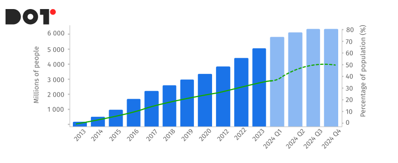
Task: Display the customer satisfaction ratings for different products (A, B, C). A bar chart broken down by products and their corresponding satisfaction scores in various categories allows for quick comparisons between them.
Bad Visualizations
Task: Display a chart of temperature changes over a month. A pie chart is not the best choice in this case, especially if it is misleading. Pie segments are ineffective at conveying trends—a line graph would be much more suitable. This is a classic example of how an incorrect chart can distort data.
Example:A bar chart with too many categories, filled with tiny bars and unreadable text. This distracts the audience, making it difficult to interpret the data. The use of many colors forces viewers to strain to understand what is represented on the chart. The chart should present data in the simplest and most readable way, rather than creating puzzles.
Task: Compare sales figures in three different libraries, but due to the intentional stretching of the x-axis, one bar appears significantly taller than the others, creating a false impression of a larger gap. A good dashboard should accurately reflect the data, not try to deceive the audience.
Conclusions
Data visualization is becoming an increasingly important tool for effective communication and decision-making in today’s information-filled world.
Well-constructed visualizations can not only transform complex datasets into understandable and visually appealing dashboards but also help companies across various industries achieve growth and success.
Key principles of best practices in data visualization:
- Clarity: The visualization should be simple, understandable, and easy to read.
- Accuracy: Data should be presented honestly and without distortion.
- Context: Provide enough information for the audience to interpret the data correctly.
- Design: Use visually appealing elements, but don’t overdo it.
- Testing: Conduct testing with the target audience to ensure that your visualization is clear and effective.
Implementing best practices in data visualization can bring numerous benefits to companies:
- Improved communication: Visual elements enable the effective transmission of complex ideas and concepts to a broad audience.
- Increased understanding and engagement: Clear and understandable visualizations help employees find information faster and make decisions based on it.
- Enhanced awareness: Visualizations can help companies showcase their activities and achievements to a wide audience.
- Stimulating innovation: Visual elements can assist in finding new ideas and solutions to old problems.
By adopting best practices in data visualization, companies can improve communication, increase understanding and engagement, stimulate innovation, and ultimately achieve sustainable development and growth.