
Introduction
Data visualization templates are important tools that help present complicated data simply and attractively. By utilizing effective data visualization templates, you can create presentations that streamline complex information and enhance understanding. These ready-made designs save time and help you focus on understanding the insights instead of worrying about how it look. Pre-designed charts allow you to quickly convey your data without starting from scratch. In this article, we will answer common questions about different data visualization templates, how to use them effectively, and their importance in various industries.
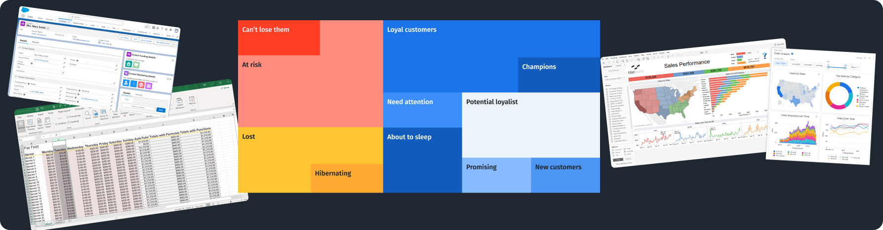
Types of Data Visualization Templates Available
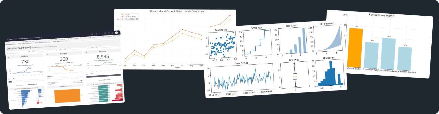
Charts and Graphs
Charts and graphs are essential for data visualization. They turn raw data into visual stories that are easy to understand. Each type of chart or graph has its benefits:
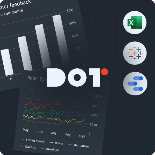
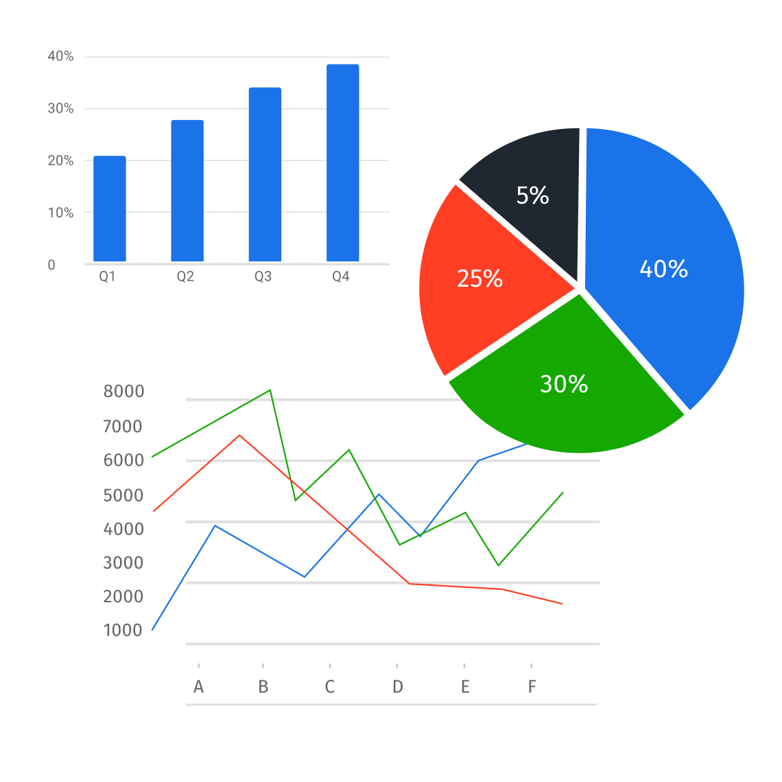
- Bar Charts: Great for comparing numbers across different groups. For example, if you want to show sales made by different salespeople, a bar chart quickly shows who sold the most. You can use tools like Microsoft Excel or Google Sheets to create a bar chart. Put your groups in one column and their numbers next to them, then choose the chart type from the “Insert” menu. Using data visualization tools can further enhance your graphs’ accuracy and visual appeal.
- Line Graphs: Perfect for tracking changes over time, like how revenue grows each quarter. Line graphs are good for showing trends. If you want to see sales patterns by season, just put time on one side and sales on the other to see the trends. For more complex data trends, consider using specialized data visualization templates that accommodate multiple variables.
- Pie Charts: Useful for showing how parts make up a whole. For instance, if you want to display the market share of different companies, a pie chart visually shows how each company compares to others. In Excel, you can easily categorize your data and use the “Insert Pie Chart” option to create one. When utilizing various data visualization templates, ensure you choose the most effective type for your dataset.
To use these templates well, choose the right one based on the message you want to share. Always aim for clarity and simplicity to connect with your audience better.
Infographics
Infographics mix visuals and text to explain complex information easily. They use graphics and short summaries to show relationships, timelines, or statistics. To create an infographic, follow these steps:
- Conceptualization: Decide the main message you want to share. Find the important data points to tell your story.
- Layout Design: Use tools like Canva or Piktochart to organize your infographic. Arrange content with a title at the top, then the main information, and finish with supporting data. Infographic templates serve as exemplary data visualization templates that can convey information effectively.
- Visualization: Add charts, icons, and images that help explain the text. Make sure visuals make things clearer, not more confusing.
Infographics can summarize reports, highlight research results, or explain processes, making complex information easier to understand. For example, biology researchers can summarize findings clearly for audiences who may not know the details. Incorporating data visualization templates into your infographics can enhance the overall appeal and clarity of your presentations. Graphic design templates can also add a professional touch to your infographics.
Specialized Data Visualization Templates
Specialized templates like dashboards and reports help manage and show complex data.
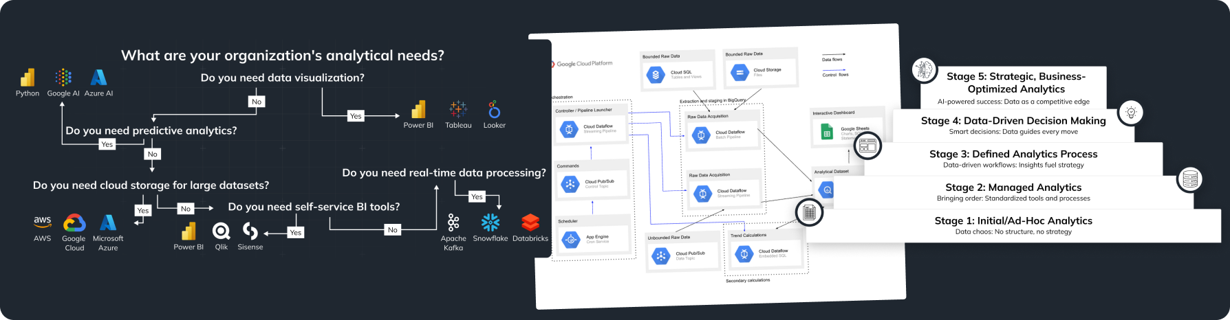
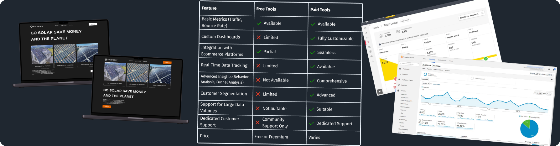
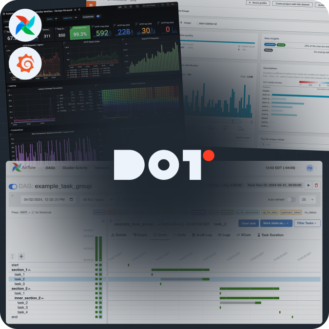
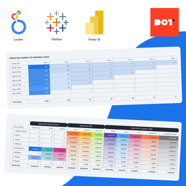
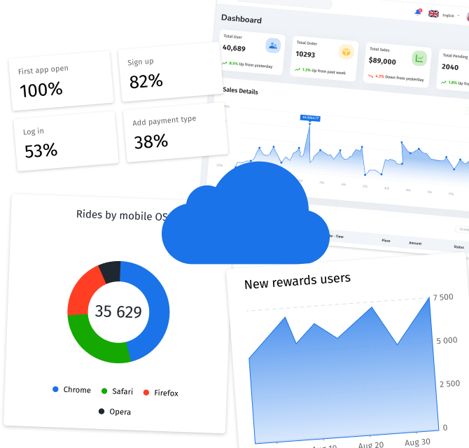
- Dashboards: They provide a quick view of key performance indicators (KPIs) or metrics. Dashboard designs bring together various data sources and show them in one place. To create a dashboard, decide which metrics matter most—for example, sales numbers or customer satisfaction—and use software like Tableau or Google Data Studio to visualize these metrics live. A retail manager might use a dashboard to keep track of sales, inventory, and customer feedback in one view, making quick decisions easier. Using data visualization templates for dashboards simplifies the design process while still delivering meaningful insights.
- Report Layouts: These give structured formats for formal presentations or documents. A typical report layout includes a summary, tables, charts, and analysis sections. Use tools like Microsoft Word or Google Docs to create a consistent report format, which helps keep reports uniform. A consulting firm could use an infographic for project timelines, a line graph for growth in meetings, or a dashboard to monitor engagement metrics in real-time, integrating various data visualization templates into their reports.
Choosing the Right Visualization Template for Your Data Presentation
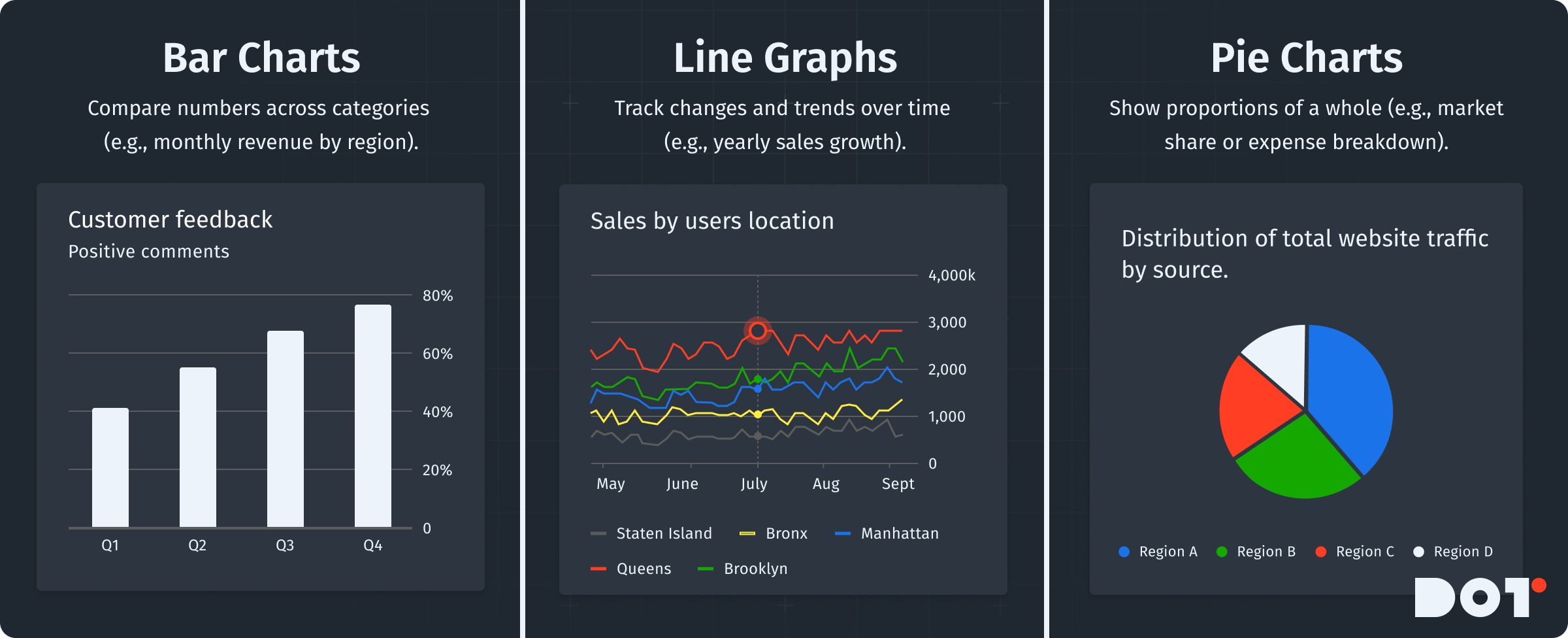
Understanding Your Audience
It is vital to know your audience for effective presentations. Tailoring your content can improve understanding and engagement. Here’s how to understand your audience’s needs:
- Identify the Audience Profile: Are they business leaders, stakeholders, or technical staff? Knowing who they are will help shape your content.
- Assess Their Information Needs: Executives typically want quick, high-level insights, while a technical team might want more detailed presentations.
- Choose Appropriate Templates: Use simple charts or infographics to highlight key points for executive groups. For technical teams, detailed dashboards or thorough reports may work better. Selecting the right data visualization templates allows you to cater specifically to your audience’s expectations.
Data Complexity and Size
The complexity and size of your data will affect your template choice. Here’s how to think about it:
- Assess Data Size: If your data has many entries, one pie chart may not work. Consider using dashboards that can show several charts and trends at once.
- Consider Data Complexity: Complex data with many variables needs advanced visuals. You can use scatter plots or heat maps to show relationships between variables. By implementing suitable data visualization templates, you can effectively manage complexity.
- Match Data Type with Template: For simple data, basic charts might suffice. However, complex data usually requires specialized templates with different axes or comparisons.
Practical Strategies for Selection
Effective template selection can be helped by these strategies:
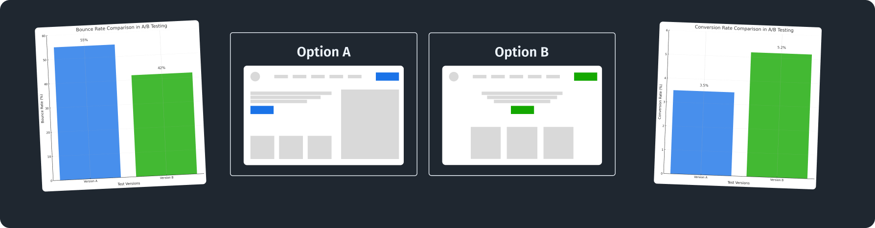
- Evaluate the Message: Think about the story your data tells. If it shows growth, use a line graph that helps visualize that trend.
- Prototype Testing: Create mock-ups of your data in different templates. Get feedback from others to find out which option works best.
- Iterate and Refine: Don’t settle for the first design. Try several versions, adjusting based on what needs more focus.
If you need help, feel free to connect with Dot Analytics experts for a free 20-minute consultation to find the best template suited to your needs!
Industry-Specific and Data Type Templates
Data Visualization Templates Designed for Specific Sectors
Some industries greatly benefit from customized visualization templates. For example, healthcare needs clear ways to show complicated patient data, while marketing focuses on templates that show conversion rates and campaign success.
Case Study: CLINARIS
CLINARIS faced issues when presenting complex infection data to healthcare stakeholders. They decided to create customizable templates designed specifically for healthcare data.
What They Did
They created templates aimed at presenting various healthcare data types clearly to different audiences, like hospital managers and infection control teams. Utilizing the right data visualization templates helped in structuring their presentations effectively.
How They Did It
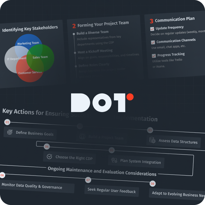
- Team Composition: They put together a diverse team of healthcare experts, data analysts, and UX designers to gather many perspectives.
- Iteration Process: They started by gathering requirements from users, then created initial designs, and kept improving based on feedback until they had effective templates.
- Project Duration: This project took about 8 weeks to develop comprehensive templates that were clear and easy to use.
Results
After using these templates, engagement during presentations increased by 30%, while misunderstandings of important information dropped by 50%. This case shows how important audience-focused design is in data presentation.
If you are curious about how templates can improve your industry, talk to a Dot Analytics expert for a free consultation to explore personalized solutions for your specific needs!
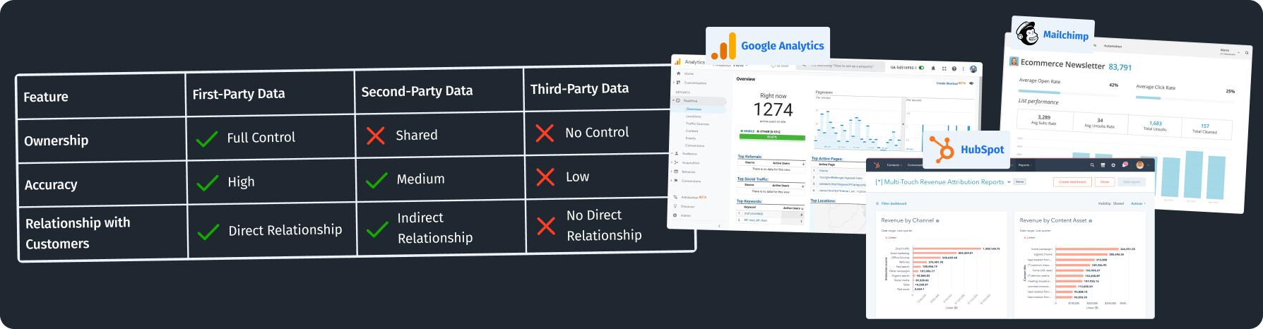
Tools and Software Compatibility
Popular Tools
Choosing the right software is key for good data visualization. Here are some popular tools that work well with data visualization templates:
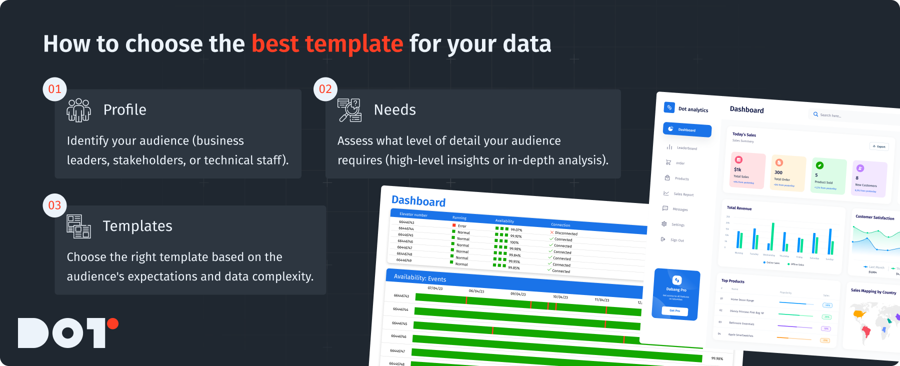
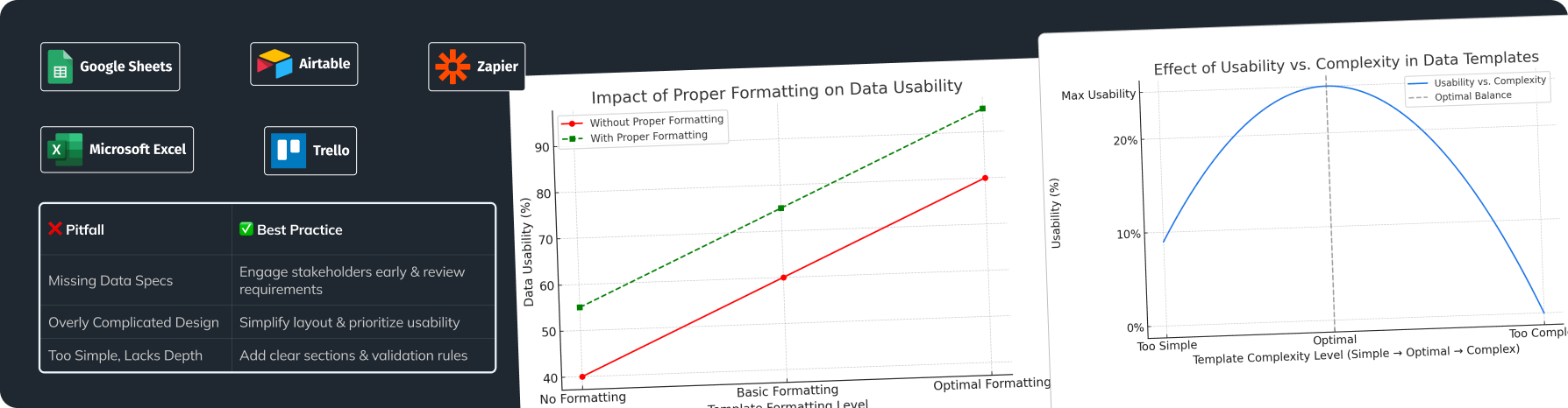
- Excel: A common tool for data management and visualization, Excel has many ready-made templates for quick data display. You can easily customize these by adding your data and selecting a chart type. The integration of spreadsheet tools with infographic templates can streamline your workflow significantly.
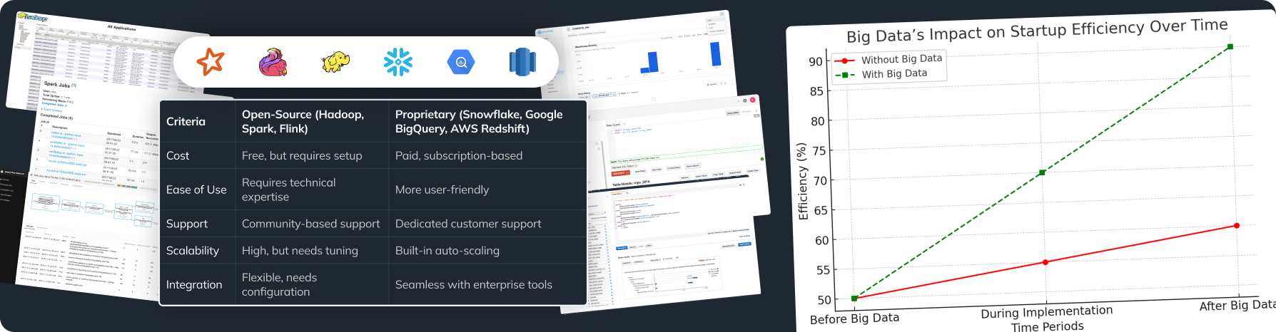
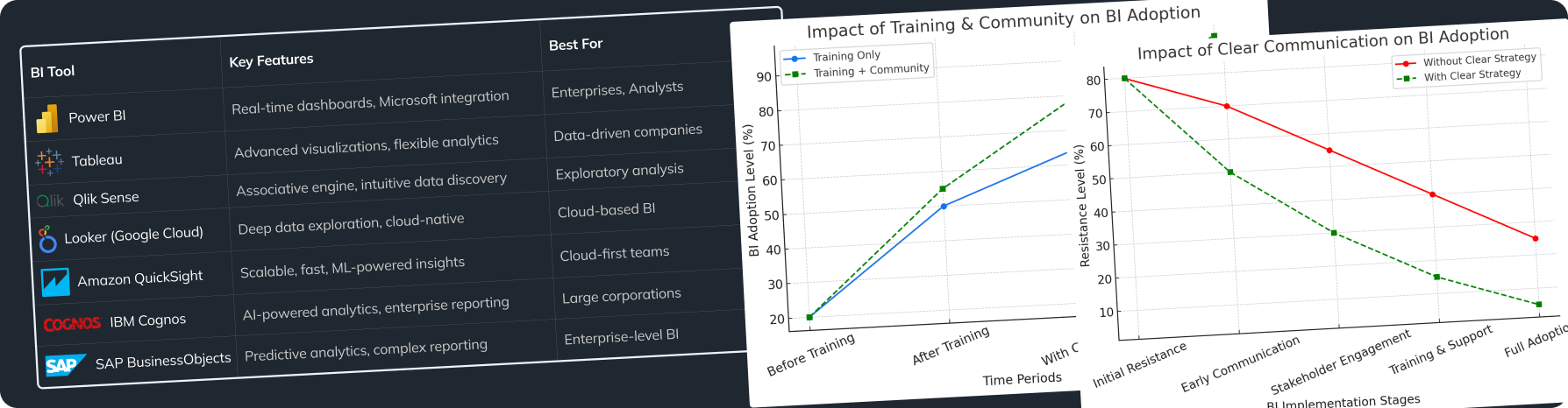
- Tableau: This is known for advanced visualization options and offers many customizable templates. It’s great for complicated datasets and includes strong tools for interaction.
- Looker Studio: A powerful tool for real-time data reporting. It can import data from Google services and integrates with existing templates to create live dashboards.
Incorporating Templates
To use templates in your software:
- Download the Template: You can find many templates online or in your software’s marketplace.
- Open the Application: Use your preferred software like Excel, Tableau, or Google Data Studio.
- Populate with Your Data: Follow the template instructions to input your specific data. Most software provides helpful guidelines.
- Adjust and Customize: Change the template as needed to match your data and audience preferences. The flexibility of data visualization templates ensures that you can tailor them to suit varying software capabilities.
When choosing software, consider how complex your data is compared to what the software can do. For complex datasets needing detailed insights, Tableau might be a better option, while Excel works well for simpler needs.
Customization Options for Branding and Style
Techniques for Modification
Customization helps keep your brand identity when using visualization templates. Here’s how to change them:
- Editing Colors: Change the colors to match your brand. Most tools have easy color-picking options.
- Font Changes: Use fonts that fit with your branding. Make sure they are easy to read to keep clarity.
- Incorporating Logos: Add your logo consistently in your visuals to strengthen your brand identity. Standardizing these elements across your data visualization templates reinforces brand recognition.
Practical Examples of Customization
By using tools like Canva, you can easily modify your templates:
- Text Modifications: Change font size, style, and color easily. For example, you can make headings bold and larger while keeping the subtext smaller.
- Icon Integration: Use built-in graphics to add icons, which can simplify the main ideas.
- Alignment and Spacing: Make sure to space everything well to create a neat layout. Proper alignment helps avoid clutter, making your visuals clearer.
Maintaining Brand Consistency
Create a branding style guide to outline your visual choices—colors, fonts, logos, and layouts. Make sure all visuals follow this guide, which helps keep a professional look in all presentations and makes your brand easily recognizable.
Cost-Effective Solutions for Data Visualization Templates
Free vs. Premium Options
Data visualization templates come in two main types: free and premium.
- Free Templates: Many platforms offer free templates. While they are available, they might have limited features. These are good for quick presentations but may not work for complex data needs. Utilizing these free data visualization templates can be a budget-friendly approach for smaller projects.
- Premium Templates: These usually provide more options and features, like interactive elements and better support. They can be a great investment for those with bigger data visualization needs.
Advantages and Disadvantages
When choosing between free and premium options, think about these points:
- Pros of Free Templates: They save money, are easy to get, and are suitable for basic needs.
- Cons of Free Templates: They might lack features, be less customizable, and often not as visually appealing.
- Pros of Premium Templates: They offer better visuals, more professional designs, and flexible use.
- Cons of Premium Templates: Cost can limit choices, and prices may vary throughout the year. Consider utilizing premium data visualization templates for more comprehensive projects to enhance your analytic capabilities.
To find the best option, look for premium templates that let you try them out before committing to buy.
Case Study: Wimlo
Wimlo, a service for childcare providers, faced budget limits while needing quality data presentation tools. They decided to use affordable visualization templates without losing quality.
What They Did
They carefully researched free and low-cost options to find solutions that fit their needs. They also ensured that these templates were easy enough for non-technical users to manage. The use of user-friendly data visualization templates helped facilitate clearer presentation outcomes for their clients.
How They Did It
- Team Composition: They included project managers, graphic designers, and financial analysts to find ways to save money while maintaining quality.
- Evaluation: The team looked closely at different sources for templates, weighing their features against what they needed.
- Project Duration: Over 12 weeks, they chose their templates and tested how easy they were to use before rolling them out.
Wimlo successfully lowered their data presentation costs by 40% while keeping quality high, leading to effective visuals that pleased stakeholders.
Ensuring Clarity of Visuals
Best Practices
Creating clear visuals means following some best practices:
- Focus on Simplicity: Avoid overcrowding your visuals. Keep text to a minimum and highlight the key points. A simple message is easier for audiences to understand.
- Consistent Labeling: Make sure all visuals have clear labels, like axis titles and legends. Consistent labeling helps understanding, especially with complicated visuals.
Common Mistakes to Avoid
When making visuals, dodge these common mistakes:
- Overcomplicating Visuals: Keep it simple to help understanding; complex visuals can confuse your audience.
- Using Clashing Colors: A bad color mix can obscure your message. Stick to colors that work well together and represent the data.
- Neglecting Context: Always give context. Explain where the data is from and what it means to make it credible.
Checklist for Evaluating Effectiveness
Use this checklist to review your visuals:
- Is key data highlighted effectively?: Make sure key insights stand out amid other data.
- Are there clear labels and a legend if necessary?: Check that every data point is clear and correct.
- Does the visual facilitate understanding at a glance?: Your visual should quickly communicate the key data without needing deep analysis.
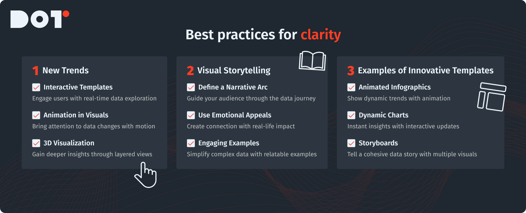
Exploring Innovative Design Techniques
New Trends
There are many exciting new techniques in data visualization, including:
- Interactive Templates: These engage users by allowing them to interact directly. They make data exploration fun and informative. Data visualization templates that incorporate interactive elements can elevate user experience significantly.
- Animation in Visuals: Adding animation can make transitions or animated data points catch attention and show changes engagingly.
- 3D Visualization: This approach provides layered insights into complicated datasets and shows multiple perspectives.
Enhancing Engagement through Visual Storytelling
Using storytelling techniques in your presentations can make your data feel like a compelling narrative. Here are some ideas:
- Define a Narrative Arc: Start with an introduction, present the data, and end with insights or suggestions. This structure helps make your presentation memorable.
- Use Emotional Appeals: Show the real-life impact of your data. For example, talking about patient care in healthcare can create a strong emotional connection.
- Engaging Examples: Use relatable analogies or examples to clarify complex data points, making your content easier for a wider audience to grasp. Infusing narrative techniques into your data visualization templates can make them more impactful.
Examples of Innovative Templates
Look for templates that include modern features, like:
- Animated Infographics: Templates that use animations to show trends or data changes dynamically.
- Dynamic Charts: Charts that update based on user interaction or data available can provide immediate insights.
- Storyboards: Combining various visual types to tell a cohesive data story guides the audience through detailed information smoothly.
Summary
In this article, we looked at many types of data visualization templates—from basic charts and graphs to specialized dashboards and infographics. Knowing how to pick the right templates for your data type and audience can significantly improve your presentations. Customization helps maintain your brand’s identity while using readily available designs. Plus, clear visuals are crucial for improving understanding. Remember that visual data representation is not only about aesthetics but also about conveying your message effectively.
Key Insights
Using templates can make your data presentation easier while still being effective. Always aim for simplicity, consider your audience, and try different designs to make the biggest impact with data visualization templates.
Final Reflections
Data visualization templates provide practical ways to improve your data storytelling skills. Want to see how this can work for your business? Schedule a free 15-minute consultation with an expert from Dot Analytics, where we help turn complex data into actionable insights!


Leave a Reply