
In this article, I would like to discuss and showcase the best practices for data visualization and prove that working with tables and charts is not always tedious and time-consuming.
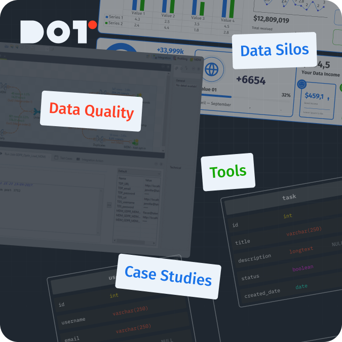
Data Visualization Best Practices: Improve Your Storytelling With Data
A well-designed dashboard should:
- Increase clarity of the current situation, making information easily accessible for the person who will use it (who may not always be deeply involved in the processes), by using understandable graphs, charts, and other visual tools.
- Improve understanding by simplifying complex concepts and relationships, using visual means to convey information faster and more effectively.
- Engage and maintain the audience’s attention (no one wants to look at gray, monotonous, endless tables) with attractive and informative visualizations.
- Aid in data-driven decision-making; the dashboard should answer the user’s questions and display not just dry numbers but patterns and trends that help make decisions based on facts rather than guesses.
Why and When to Use Data Visualization
Data visualization is the process of transforming large numerical datasets into graphical representations, such as charts, graphs, and maps. It plays a crucial role in data analysis by making information more understandable, accessible, and persuasive.
Reasons for using data visualization:
- Enhancing understanding: Visualizing elements allows for quickly conveying the essence of information, highlighting trends, patterns, and relationships that may be unnoticed in textual or tabular formats.
- Improving communication: Effective visualizations can clearly and concisely communicate complex ideas to a broad audience, even those without specialized knowledge.
- Facilitating decision-making: Visual representations of data help analyze information more quickly and make decisions based on facts.
- Increasing engagement: Attractive and informative visualizations can captivate the audience, speeding up and simplifying the process of exploring data.
When it is advisable to use data visualization:
- When working with large volumes of data: Visualization allows displaying large amounts of information in an easily digestible format.
- When comparing data: Graphs and charts enable quicker and easier comparisons of various metrics and identifying differences between them.
- When depicting trends: Data visualization is excellent for showing changes in metrics over time.
- When conveying information to people who are not involved in the processes: Well-designed visualizations do not require specialized knowledge and can be understood by individuals with varying levels of initial understanding.
I can also note that, in some cases, a textual format may be more appropriate, for example, when needing to display and compare qualitative indicators or detailed descriptions. It is essential to choose the data presentation format that best aligns with the goals and objectives.
Crucial Steps to Effective Data Visualization
Before starting to create a dashboard, it is essential to define the specific goals it should address, as this will help ensure that your visualization is relevant and clearly answers the questions posed.
1. Defining Strategic Questions
Each visualization should be built hierarchically, meaning there is one strategic goal being displayed and several metrics related to that strategic goal.
Example: How has our gross income changed in both absolute and percentage terms during the current reporting period, and what factors influenced this?
The goal here is to represent gross income graphically over days/weeks/months (depending on the level of detail needed), with metrics related to the goal, such as: where the income came from (which stores or which traffic sources generated the most), which products were more popular, and the average transaction value.
Also, when creating the visualization, consider the following questions:
- Will the dashboard’s client understand what is depicted?
- What conclusions do I want to convey with this data?
- Will this help make decisions based on this information?
2. Setting Clear and Achievable Goals:
After defining the strategic questions, it is necessary to translate them into clear tasks with specific outcomes you want to see/demonstrate.
When setting tasks, consider the following:
- Clarity of the task: Instead of a vague goal like “understand sales trends,” set a more specific one, such as “identify the top three product categories that led in sales growth during the last reporting period.”
- Link to metrics: How can you determine if the goal has been achieved? You need to highlight key metrics, such as an increase in website traffic or a specific conversion percentage from users to buyers.
- Purpose of the visualization: Do you want them to make a decision, adjust a strategy, or simply gain a deeper understanding?
Examples:
- Poorly defined task: Display data on website traffic.
- Well-defined task: Create a bar chart with a fill for comparing website traffic across different marketing sources/channels to help identify the most effective channel for attracting users.
By defining clear goals, you ensure that your dashboard will not only be visually appealing but also facilitate understanding.
The goal should be the endpoint to orient yourself to at all stages of the dashboard creation process, from choosing metrics to the type of graph used.
3. Know Your Audience
Creating dashboards that are effective requires not only skills in using tools but also an understanding of who you are creating them for.
Whether you are designing a dashboard for colleagues or for a broader audience, it is important to adapt the visual elements and depth of data presentation to your audience’s experience, engagement level, and expectations. Creating a visualization tailored to a specific group will maximize its clarity and engagement.
Assessing Data Engagement and Experience:
- Data Literacy: Understand how well your audience is familiar with reading and interpreting data in your niche/project.
- Experience with Dashboards: Determine how familiar your audience is with various types of tables and graphs and how to interpret them.
- Preferences and Expectations: Consider what visualization formats your audience prefers and what expectations they have for them.
Adapting the Visualization:
- Complexity: Take into account your audience’s data literacy when choosing the complexity of the visualization.
- For less engaged audiences: Use simple charts, such as bar and pie charts, with clear legends and titles.
- For more engaged audiences: You can use more complex visualizations, such as heat maps or scatter plots, assuming the audience will be able to understand them.
- Style: Align with the visual style preferred by your audience.
- For a more formal, business audience: Use a professional and restrained style with a neutral color palette.
- For a younger or more informal audience: Bright colors and creative designs can be utilized.
- If your company has a brand book, dashboards should be created in corporate colors.
- Text: Use language and terminology that are understandable to your audience.
- Avoid using industry-specific terms that may be unfamiliar to your audience.
4. Choose the Right Visualization Tools
Choosing the right visualization tools is crucial for effectively presenting information and achieving the goals of your visualization. There is no one-size-fits-all type of chart that suits every situation. Instead, there are many types of charts and graphs, each of which is better suited for displaying specific data.
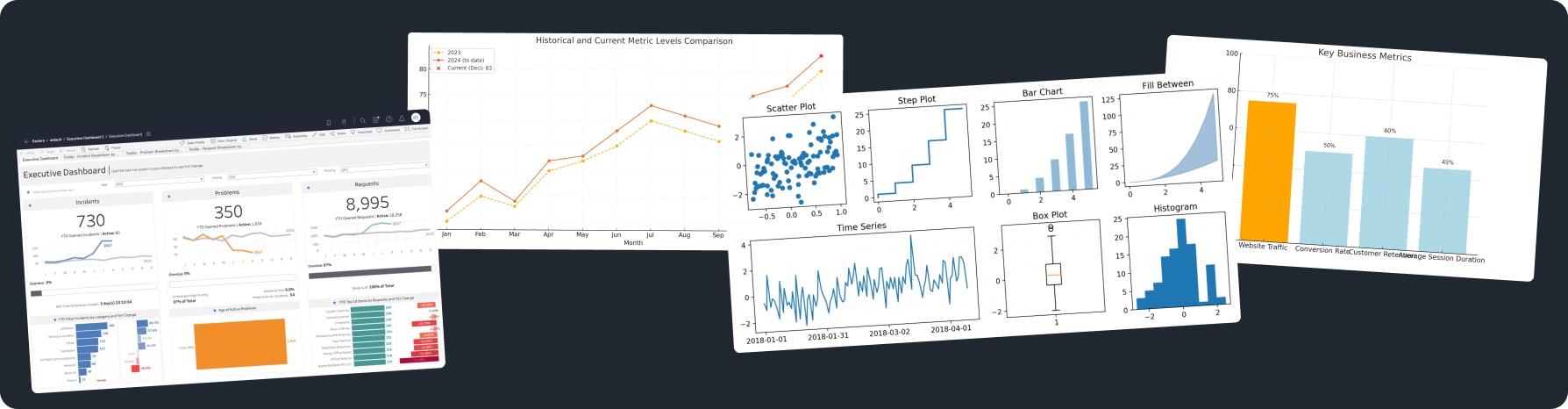
1. Choosing the Type of Chart:
For Comparing Data: To compare values across different categories, use bar charts, line charts, or pie charts.
For Displaying Trends: To show changes in metrics over time, use line charts or moving average charts.
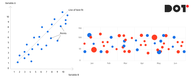
For Displaying Relationships: To illustrate the dependencies between variables, use scatter plots or bubble charts.
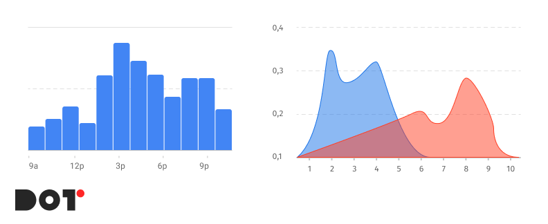
For Displaying Distribution: To represent the distribution of data, use histograms or density plots.
2. Effective Use of Color, Scale, and Layout:
- Color: Use colors to highlight important data, but try to avoid using too many colors or color combinations that may distract the audience.
- Scale: Choose a scale that allows you to see all the values of your data without distorting them.
- Layout: Arrange the elements of the dashboard in a structured manner, ensuring there is enough space between them.
Recommendations:
- Use one type of chart in the dashboard as the primary one and a few smaller ones as additional.
- Avoid overloading charts with too many categories of data; it is better to highlight the top 5 or top 7 and group the rest into a single category.
- Add titles, axis labels, and a chart legend for greater clarity.
- Avoid 3D effects, unnecessary embellishments, and excessive images, as they can make your dashboard less readable.
- Maintain a consistent style throughout the entire dashboard.
- Remember that the best dashboard is the one that most effectively conveys your message to your audience.
5. Organize and Design with Precision
Effective organization and design of a dashboard are crucial for making information clear, visually engaging, and easy to understand.
Visuals:
- Hierarchy: Identify the most important data and organize it accordingly.
- Focus: Use no more than three design elements for each category, such as color, text size, and font, to avoid distracting the audience.
- Standardization: Group similar elements into blocks to facilitate perception.
- Simplicity: Avoid overcrowding the dashboard with too many charts, tables, and text so the audience does not lose focus on the main messages you want to convey.
Balance Between Visual Appeal and Functionality:
- Use Visually Appealing Elements: Visual elements can enhance your visualization but can also detract from it; strive to use more classic colors, fonts, and images.
- Readability: Ensure that text and chart elements are distinguishable and easy to read.
- Avoid Unnecessary Embellishments: Design elements should complement and alleviate the uniformity of charts and tables, rather than being the main focus of the dashboard. The design should not distract from the data.
Some Additional Tips:
- Use a grid or guideline to create uniformity and balance.
- Leave enough space between dashboard elements to avoid clutter.
- Use contrasting colors or bold fonts to highlight important elements, but do not overdo it.
- Stick to a consistent color scheme across all pages of the dashboard.
- Remember that the primary goal of the dashboard is to effectively convey information, not to showcase your design skills.
6. Refine Through Testing
Creating effective data visualization is an iterative process. After you have developed the initial concept and design, it is advisable to gather feedback and refine it to ensure maximum alignment with the audience’s needs.
1. Review Design Based on Feedback:
- Conduct Testing with the Target Audience: Show your dashboard to your audience and ask them for their feedback.
- Identify Pain Points: Ask them to share what they understand and what they do not. Is it easy for them to interpret the data?
- Make Changes Based on Feedback: Use the feedback received to improve clarity, structure, and design.
Some Testing Tips:
- Conduct testing with both individuals familiar with your data and those who have not seen it before.
- Ask open-ended questions to gather detailed feedback.
- Observe how users interact with the dashboard.
2. Impartial Presentation of Data:
- It is crucial to avoid creating visualizations that mislead, manipulate, or distort data.
- Be careful when using similar colors in one chart to prevent different data categories from visually merging into one.
- Provide a description: Offer enough information for users to understand which data is being used.
How to Make Data Visualization Inclusive
Creating inclusive data visualizations is not just a courtesy; it is a necessity. When developing visualizations, it is essential to consider various factors, such as visual impairments, color blindness, and cultural interpretations of visual elements. By following these guidelines, you can create inclusive visual elements that are understandable and informative for everyone:
Consider Visual Impairments:
- Avoid using low-contrast colors to convey information.
- Use large and easily readable fonts.
- Consider providing text descriptions for images.
Take Color Blindness into Account:
- Avoid using color combinations that are difficult for color-blind individuals to distinguish. For example, do not use red and green together.
- Use contrasting colors: Colors that are on opposite sides of the color wheel are usually easily distinguishable for color-blind individuals.
- Use color schemes based on brightness perception.
Acknowledge Cultural Differences:
- Avoid using symbols or images that may be offensive to certain cultures or related to religion.
- Use neutral color schemes as much as possible.
- Consider cultural nuances in information perception.
- Conduct testing with individuals from target cultures: Ask people from these cultures to provide feedback on your dashboard.
Conduct Testing with Individuals with Disabilities:
- Test your visualization with individuals who have the disabilities you want to accommodate in your dashboard.
- Ask them about their experiences and request feedback.
- Make changes to your visualization based on the feedback received.
By prioritizing inclusivity in your data visualizations, you enhance accessibility and ensure that your work effectively communicates insights to a broader audience, making data more equitable for all users.
Ensuring Accurate Storytelling in Data Visualization
It is essential to remember that visualizations can be interpreted in various ways, and if they are not created with care, they can distort or mislead viewers. Here are several points to consider:
1. Honest Representation of Data:
- Avoid Data Manipulation: Do not distort axis scales, truncate data, or use other methods that may alter the true representation of the data.
- Use Appropriate Chart Types: Choose chart types that accurately reflect the type of data you want to present.
- Avoid Information Overload: Do not overwhelm the dashboard with excessive data or elements, as this can hinder interpretation and understanding.
2. Add Descriptions:
- Include Legends and Titles: Clearly label all elements of the dashboard and provide contextual information necessary for understanding the data.
- Use Colors and Symbols Meaningfully: Do not use colors or symbols just for the sake of using them. Ensure that they are necessary and have clear meanings.
- Provide Supplementary Descriptions: Add descriptions to help the audience understand complex data or concepts.
3. Work on the Design:
- Use Readable Fonts and Colors: Ensure that the text is easy to read and that the colors do not blend together or cause discomfort.
- Create Balance: Distribute elements evenly throughout the dashboard and avoid clutter.
- Utilize White Space: Leave enough space between elements so that the visualization does not appear crowded.
4. Conduct Testing:
- Show Your Visualization to Others: Gather feedback from individuals who were not involved in creating the dashboard to understand how clear and user-friendly it is.
- Make Changes Based on Feedback: Use the feedback received to enhance the clarity, accuracy, and design of your dashboard.
By prioritizing honest representation, clear descriptions, thoughtful design, and thorough testing, you can ensure that your data visualizations convey accurate stories that effectively inform and engage your audience.
Good & Bad Data Visualization: Examples
Data visualization is a very useful tool, but like any tool, it must be used correctly. This section will present several good and bad visual solutions that directly impact information perception.
Good Visualizations:
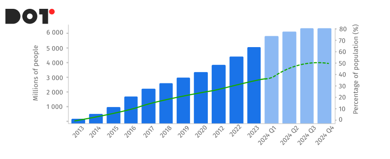
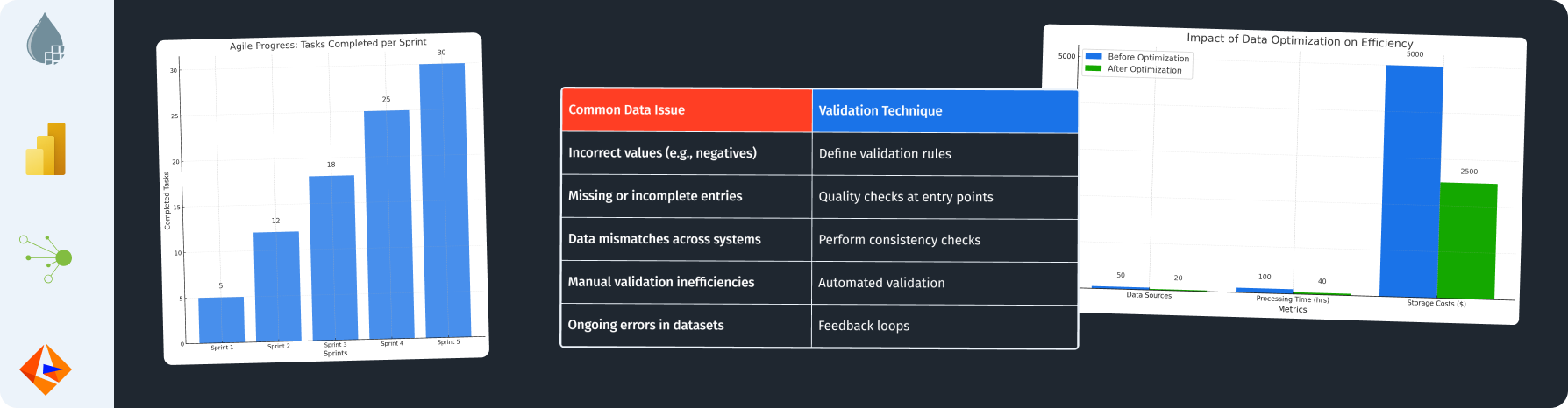
Task: Display the growth of internet usage worldwide. The best choice for this is a line graph with a clear time axis on the X-axis and the number of users on the Y-axis. Additionally, adding a trend line can enhance the visualization. The audience will easily see the steady increase in internet usage over time.
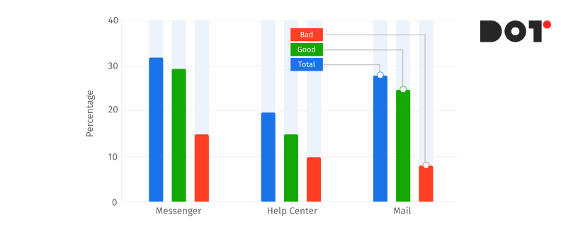
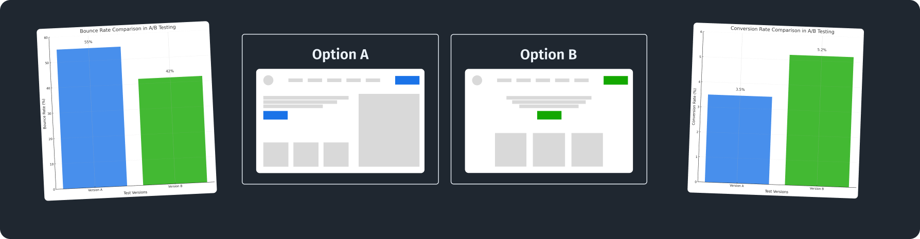
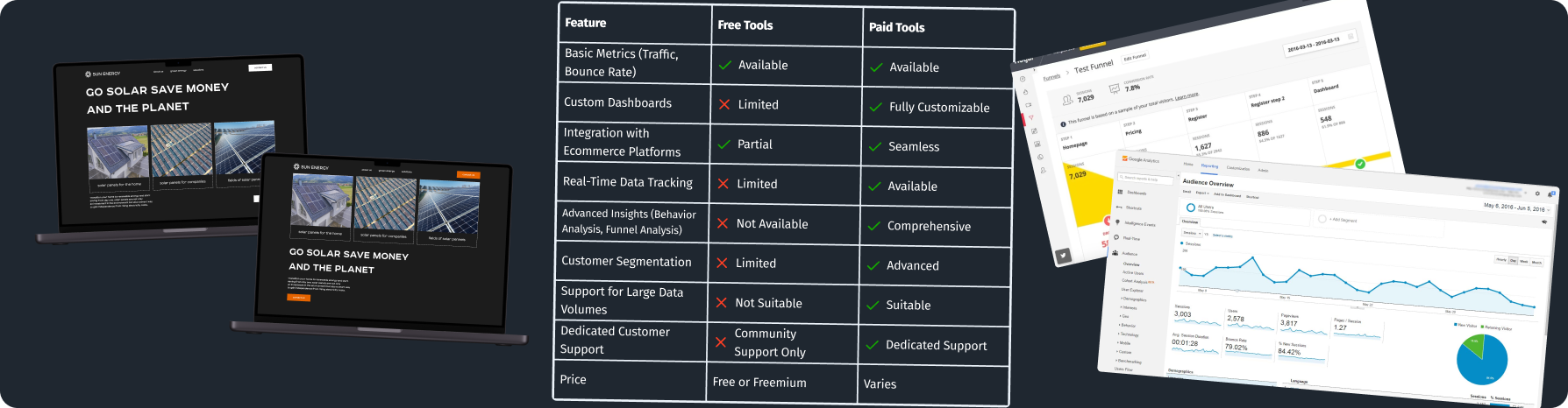
Task: Display the customer satisfaction ratings for different products (A, B, C). A bar chart broken down by products and their corresponding satisfaction scores in various categories allows for quick comparisons between them.
Bad Visualizations
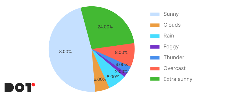
Task: Display a chart of temperature changes over a month. A pie chart is not the best choice in this case, especially if it is misleading. Pie segments are ineffective at conveying trends—a line graph would be much more suitable. This is a classic example of how an incorrect chart can distort data.
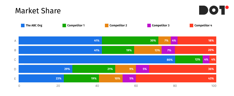
Example:A bar chart with too many categories, filled with tiny bars and unreadable text. This distracts the audience, making it difficult to interpret the data. The use of many colors forces viewers to strain to understand what is represented on the chart. The chart should present data in the simplest and most readable way, rather than creating puzzles.
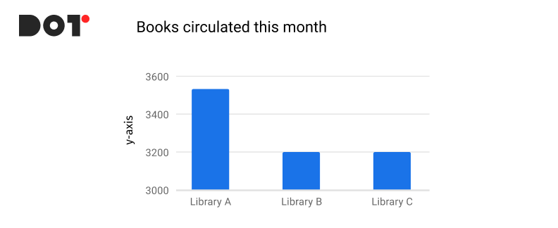
Task: Compare sales figures in three different libraries, but due to the intentional stretching of the x-axis, one bar appears significantly taller than the others, creating a false impression of a larger gap. A good dashboard should accurately reflect the data, not try to deceive the audience.
Conclusions
Data visualization is becoming an increasingly important tool for effective communication and decision-making in today’s information-filled world.
Well-constructed visualizations can not only transform complex datasets into understandable and visually appealing dashboards but also help companies across various industries achieve growth and success.
Key principles of best practices in data visualization:
- Clarity: The visualization should be simple, understandable, and easy to read.
- Accuracy: Data should be presented honestly and without distortion.
- Context: Provide enough information for the audience to interpret the data correctly.
- Design: Use visually appealing elements, but don’t overdo it.
- Testing: Conduct testing with the target audience to ensure that your visualization is clear and effective.
Implementing best practices in data visualization can bring numerous benefits to companies:
- Improved communication: Visual elements enable the effective transmission of complex ideas and concepts to a broad audience.
- Increased understanding and engagement: Clear and understandable visualizations help employees find information faster and make decisions based on it.
- Enhanced awareness: Visualizations can help companies showcase their activities and achievements to a wide audience.
- Stimulating innovation: Visual elements can assist in finding new ideas and solutions to old problems.
By adopting best practices in data visualization, companies can improve communication, increase understanding and engagement, stimulate innovation, and ultimately achieve sustainable development and growth.


Leave a Reply